Insights
Overview
Insights is a powerful and flexible tool designed to visualize trends and compositions within your data. You can analyze events, cohorts, and user profiles, and display the data in a wide variety of chart types.
Advanced Insights features also allow you to create formulas, compare current data to past data, and generate custom events and properties for deeper analysis.
Use Cases
Here are some of the sample questions you can answer in Insights:
- Product Analytics
- How is my WAU changing over time? (unique users)
- How often are my users getting value? (frequency analysis)
- What is the distribution of my users across regions/devices etc? (property breakdown)
- Lifecycle analysis (opens in a new tab)
- B2B (in this case, a messaging application)
- How many messages were sent in the US in the past 30 days? (total events, filtered)
- How many users had a mobile app session yesterday? (unique events)
- How many messages are sent per session? (formulas)
- How much revenue was generated on plans purchased in the past year? (property aggregation)
- How has the power users cohort grown over the past 6 months? (cohort trends)
- Marketing
- Which advertising campaigns generate the most checkouts? (property breakdown)
Frequency Analysis
It's important to know what's the natural frequency at which your users use your product and experience the core value proposition of your product--do the majority of your users use your product daily? Weekly? Monthly? A16Z wrote a great article about the Power User Curve (opens in a new tab), and this video (opens in a new tab) shows how you can reproduce that within Mixpanel.
Quick Start
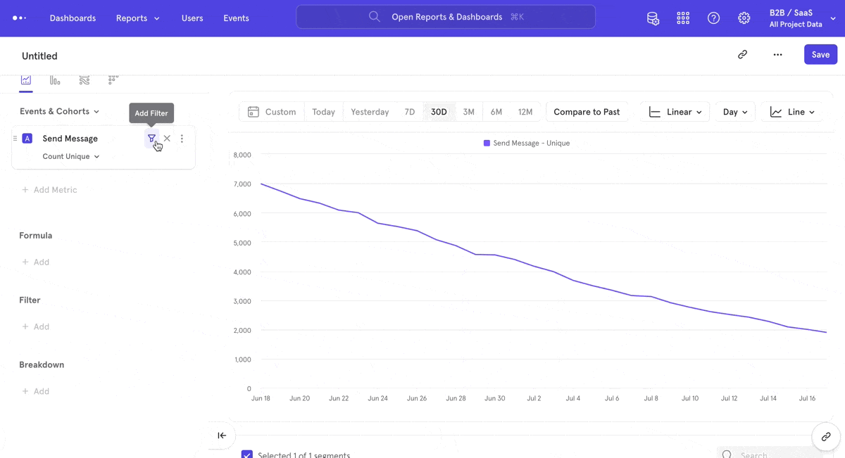
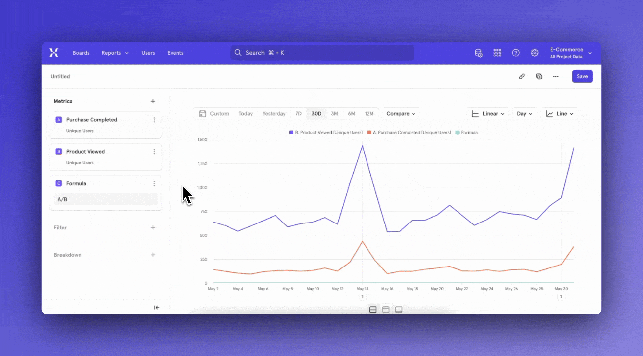
Step 1: Choose or Define your Behavior
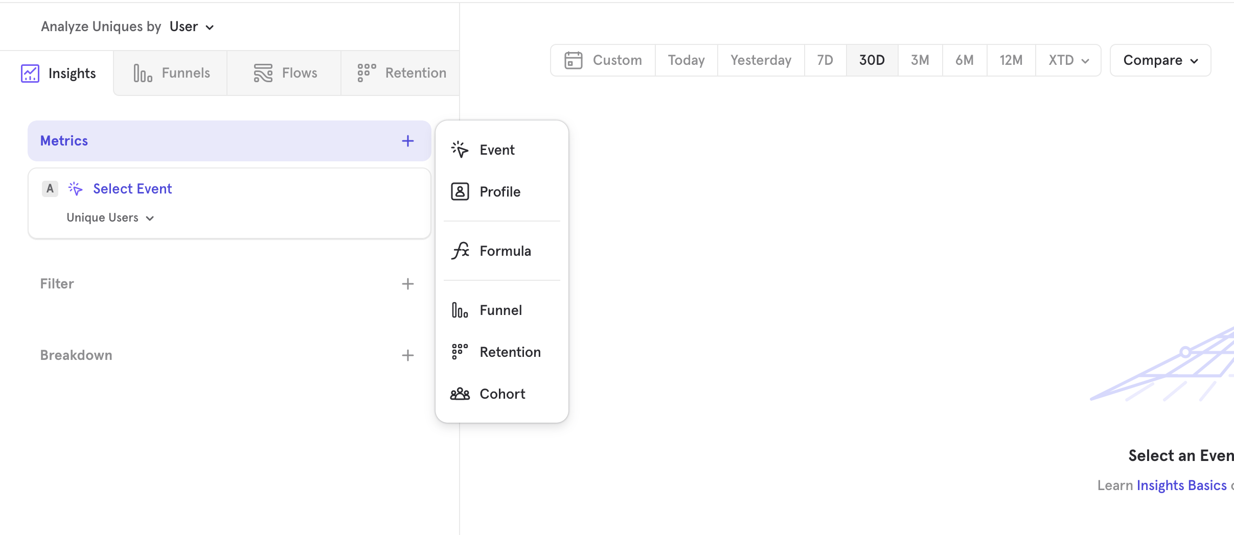
Metrics are basing building blocks of an Insights report. A metric is made up of a behavior, and a way to measure that behavior. By default, Insights will prompt you to select the most basic form of a behavior: an event. However, you can also press the "+ Metrics" button to select add a metric based on a different type of behavior. You can also add a formula, which is a metric that is a function of other metrics.
To select an event and start with an event based metric, press "Select Event".
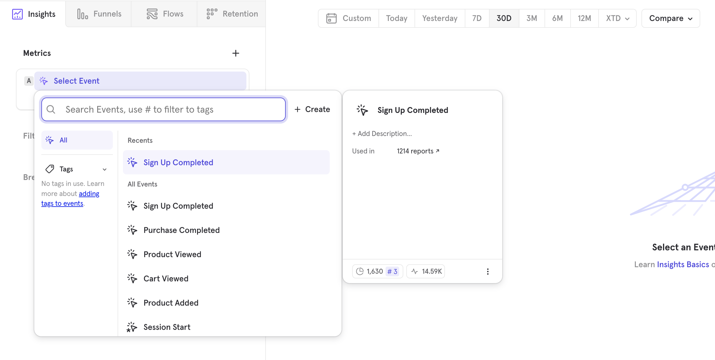
To select a different type of metric, press "+ Metrics" and choose your metric type from the list. See Metric Types for a full list of supported metric types.
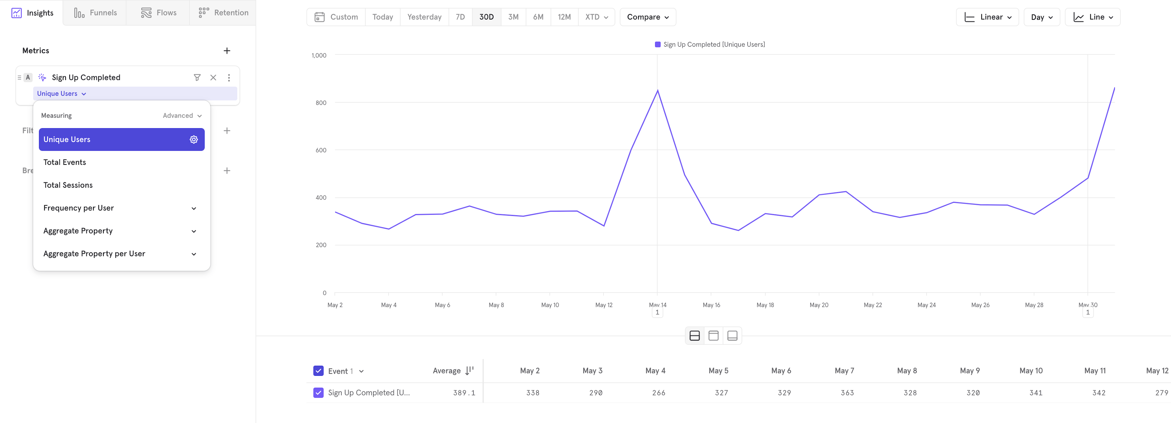
Step 2: Choose your Measurement
Once you've selected your behavior, you can choose how to measure that behavior. Depending on the type of behavior selected, Insights will default to a different measurement. If you're measuring a basic event, Insights will default to measuring the nubmer of unique users who have done that event.
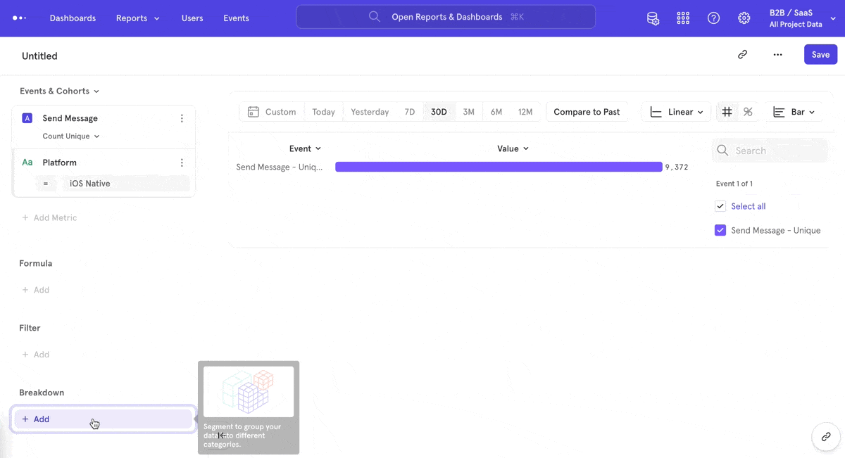
Step 3: Choose Filters
Filters exclude unwanted data. In this case, we only care about events performed on the iOS platform. Therefore, add a "Platform" filter, where Platform equals "iOS Native". At this point, your query should look like this:
Step 4: Choose Breakdowns
Breakdowns segment data into groups. In this case, we want to count message-sending users in different cities. Therefore, add a "City" breakdown. At this point, your query should look like this:
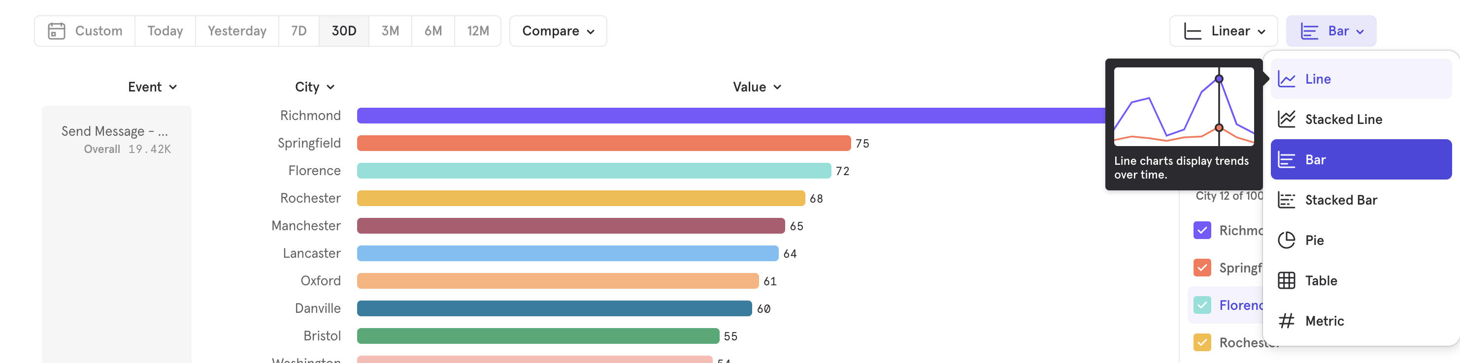
Step 5: Change Visualization
Choosing a different chart can help you visualize data better. Line charts help you see a trend, but other charts will help you see the aggregate value.
Step 6: Analyze Results
You now have a full analysis that you can use and add onto a Board, or use as a starting point to dig in further. This might mean adding more filters or breakdowns, or adding another metric and seeing if there's an interesting comparison to be made. You could also change the counting type or the chart type.
Basic Features
Metric Types
| Metric Type | Description |
|---|---|
| Event | A metric based off of a single event. The metric could measure the total number of occurences, unique users, or aggregates a property of this event. |
| Profile | A metric based off of the user or group profiles. You can measure the number of profiles, or an aggregate on properties of the profiles. |
| Formula | A metric that is a function of other metrics. You can select a saved formula, or create a new formula based on the existing metrics in the report. |
| Funnel | A metric based off a funnel behavior. You can select a saved funnel behavior or define a new funnel, then choose a measurement on that funnel to form a funnel metric. By default measures conversion rate on all steps of the funnel. |
| Retention | A metric based off a retention behavior. You can select a saved retention behavior or define a new retention, then choose a measurement to form a retention metric. By default, measures retention rate. |
| Cohort | A metric based off of a defined cohort. Measures the number of users who are part of that cohort. |
If choosing Formula, Funnel, Retention or Cohort, you will be prompted first to selected a saved definition. If you wish to start by defining your own behavior, press "Create" in the top right of the menu.
Chart Types
Insights feature multiple visualizations to help you view the query results in the clearest chart type. By default, Insights displays the results on the line chart, which helps you understand how metrics trend over time. However, another chart type might present the results with more clarity. In Insights, you can choose to get a metric calculated either across the entire time period selected in the date picker or on a time-segmented view of the metric (e.g. daily breakdown).
- Metric calculated across the entire time period
- Bar chart
- Stacked bar chart
- Pie chart
- Metric chart
- Table chart
- Metric time-segmented
- Line chart
- Stacked line chart
Rename an Event within a Report
Click on the "three dots" icon beside an event and click Rename to rename it. This will only affect the current report, and will not change the event's name in other reports.
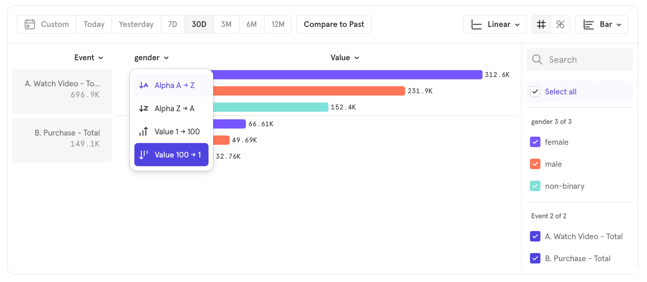
Sorting
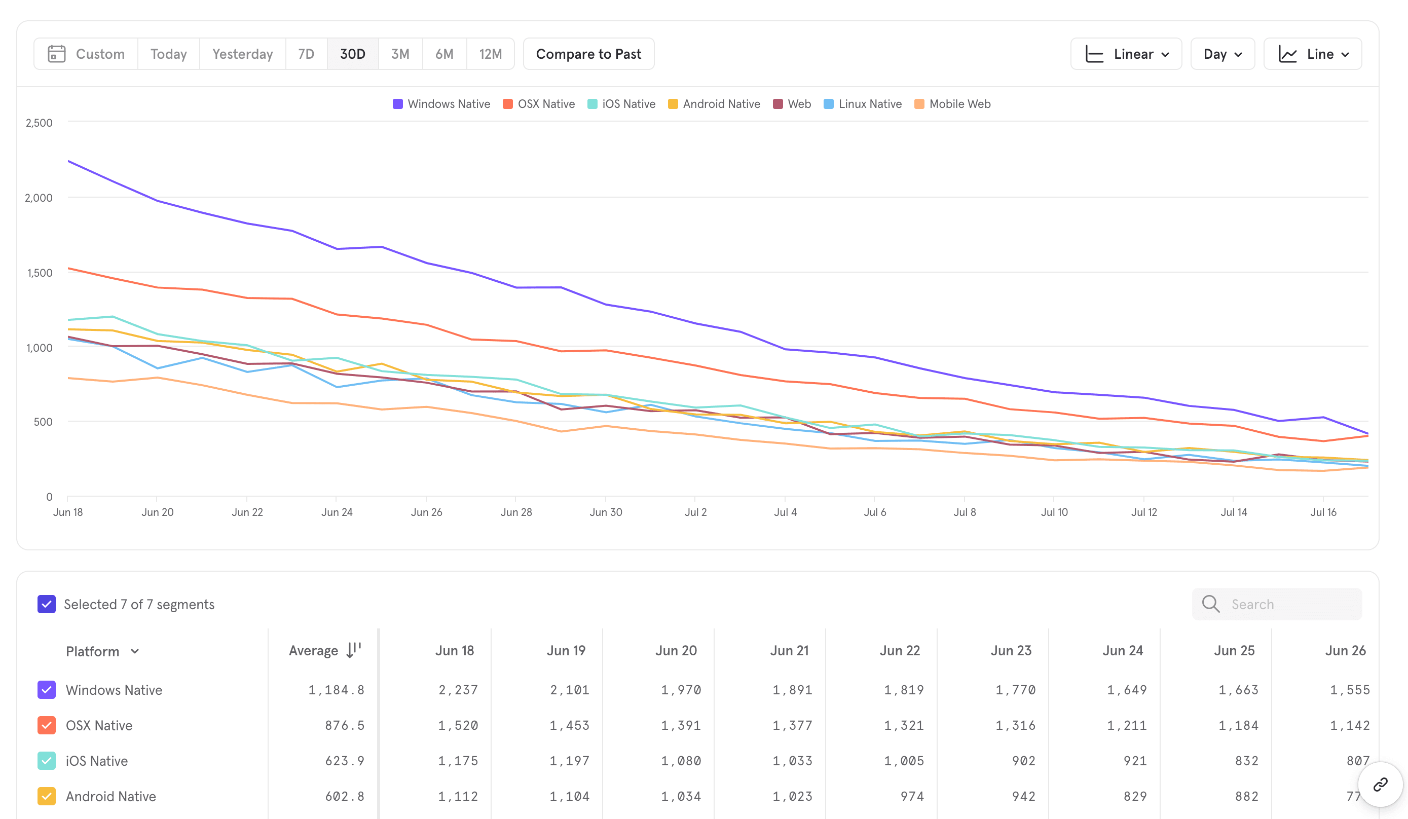
Bar chart
When you view a bar chart, you have four different sorting options: A-Z Ascending, Z-A Descending, Value Ascending, or Value Descending. To switch the sorting view, select the Events or property name column header in the upper left hand of the results and then select which sorting order you would like to see.
Line chart
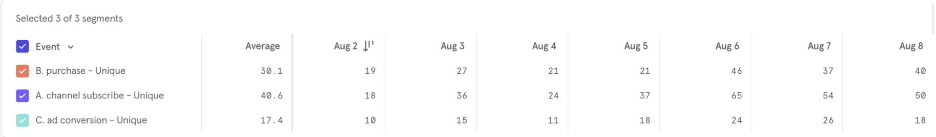
Line charts in Insights are accompanied by a table of values that gives users another way to consume the trends information. This data table can also be sorted by clicking the column headers.
Click on a column header to sort by that column. Click the header again to reverse the sorting order. For example, the table below is sorted by event counts on August 2nd:
Results that are segmented (from one or more "group by" clauses in your query) have four different sorting options when you click on the "segment column" headers:
- Segment A-Z Ascending: sort by segment name in ascending order
- Segment Z-A Descending: sort by segment name in descending order
- Value Ascending: sort by segment value in ascending order
- Value Descending. sort by segment value in descending order
When sorting by segments, the sort is carried out from left to right.
Clicking on the "Average" data column performs a flat sort across all segments:
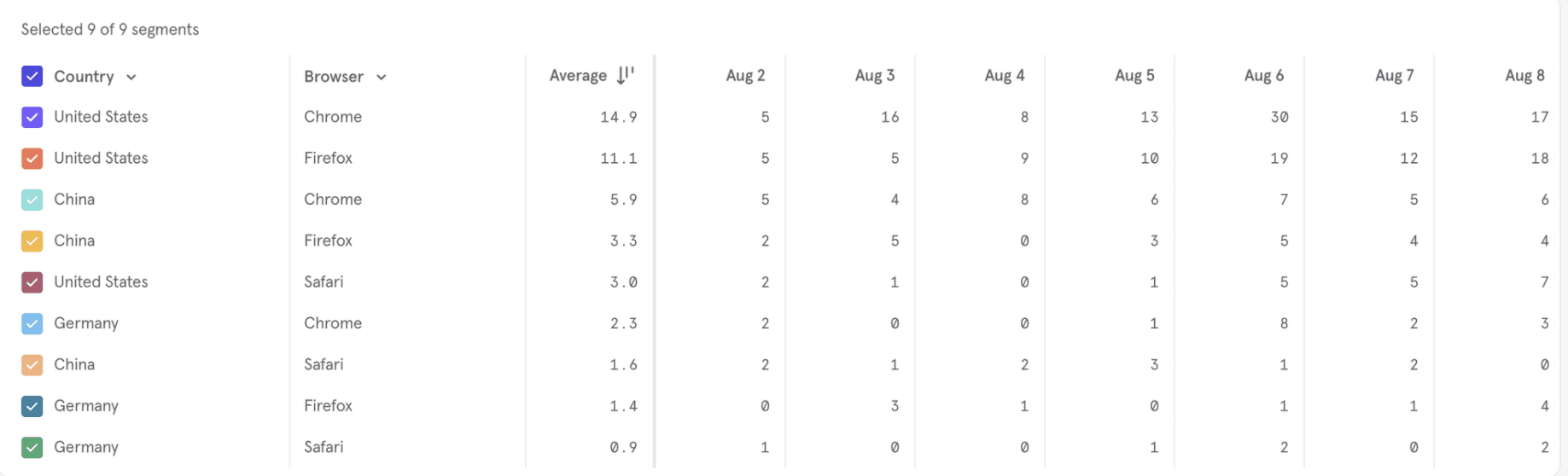
Table chart
Tables are useful to see the precise values of your data and to quickly scan multiple metrics per segment. In general, tables work similarly to the rest of Insights, with a few extra features.
Sort Order
You can configure how you want rows in the table to be sorted, with our global sorting control.
Grouped View vs Ungrouped View
The Ungrouped View removes all hierarchy and makes the table flat. Each combination of segment values is treated as a row, independently of the other rows.
The Grouped View preserves the hierarchy of breakdowns. It shows you segments within a breakdown as displayed below. This view is only applicable when you have 2 or more breakdowns
Alphabetical vs Value-Based Sorting
You can sort segments alphabetically or by the value of a particular metric. In the grouped view, sorting is configured on a per-breakdown level and respects the breakdown hierarchy.
In the below image, we sort Country within Item Category, which respects the hierarchy.
Hierarchy is defined by the breakdown order in the query panel:
View “N” segments
The View “N” control lets you decide how many rows to display per breakdown in your table.
In the ungrouped view, choose the number of rows to display:
In the grouped view, you can choose the number of rows you want to display for each breakdown:
Notes
- View N only controls how many segments to display. To decide which segments to display i.e if it’s the top segments by value or bottom segments by value or alphabetical, please change the “Sort Order”.
- View N will show the minimum of N and how many segments are in your report. For example, if you set N=10 but you only have 7 segments, we will only show 7 rows.
- When selecting “Show All”, the maximum number of segments displayed in the UI will be 3000 given cardinality limits. If your breakdown has more than 3000 segments, you'll only see the top 3000, dictated by the sort order.
Overall and Segment Sub-Totals
Overall: This refers to the value considering all the segments, independent of whether displayed or not based on your View N control; i.e changes to View N will not affect Overall numbers
Sub-Totals: In the grouped view, in addition to the Overall, segment sub-totals are also displayed. Similar to “Overall”, these values are independent of the View N control
Visualization Settings
The visualization options allow you to choose how the data is visualized. The options are:
- Linear: This is the standard view for the chart.
- Logarithmic: A nonlinear scale based on orders of magnitude, rather than a standard linear scale, so the value represented by each equidistant mark on the scale is the value at the previous mark multiplied by a constant.
Advanced
Formulas
Use Formulas to make calculations using simple arithmetic operators.
Mixpanel supports the following operators:
- + : Add
- - : Subtract
- * : Multiply
- / : Divide
- () : Use parentheses to influence the order of operations
You can also use numbers as constants in a formula. Multiply a ratio by 100 to display as a percentage, for example. Divide a property value tracked in seconds by 3,600 to display the value in hours. You can rename a formula by selecting Rename in the overflow menu of the formula.
Click the Metrics button, then select Formula.. Each event in the query shows a letter next to it, which indicates its variable name. Use these letters in combination with the operators to calculate a more advanced query. For example, you can use the DAU, WAU, and MAU functions in Formulas to calculate the stickiness of your product:
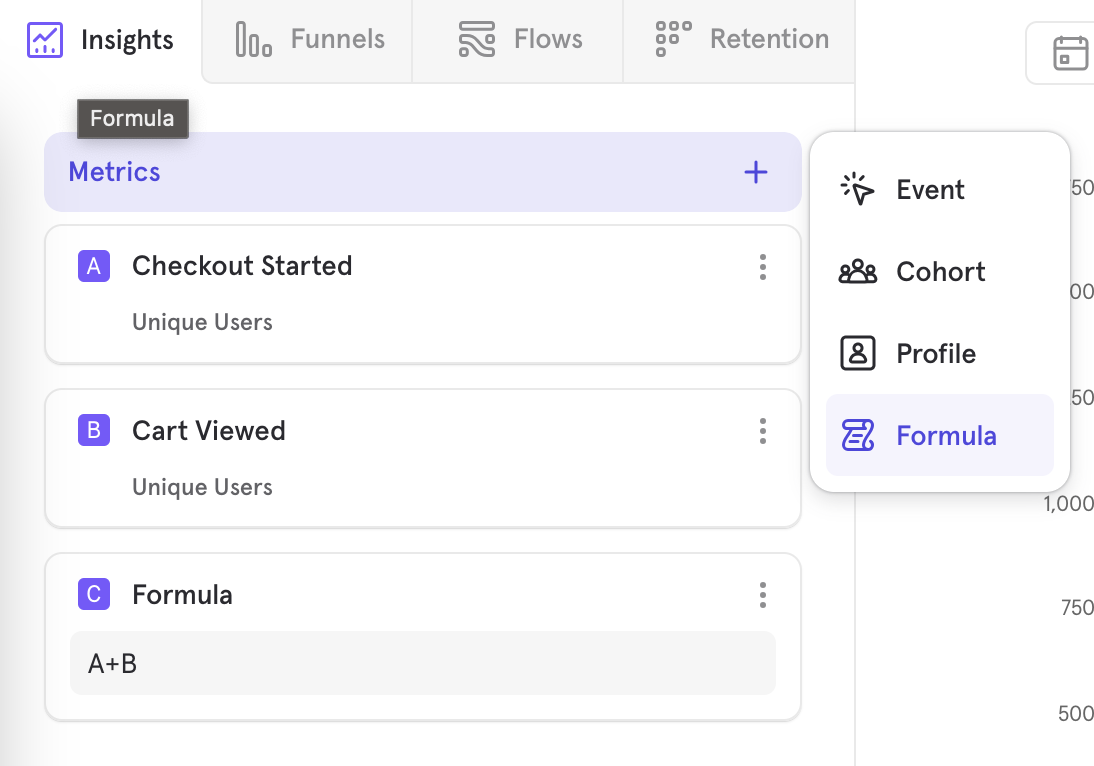
To note, you cannot nest a formula metric when constructing another formula.
Save formulas for re-use
Use existing events to create calculated formulas, like Bounce Rate & % Active Users, that can be saved and reused by others within the project.
Some nuances to note:
- Once you save a formula, A,B,C refer to what’s within the saved formula modal
- To edit a saved formula, expand the metric and edit inline, and then save
- When a saved metric is updated, it will update across all reports it’s being used in
- A saved formula can’t reference another formula
To access and re-use saved formulas, click on “+Formula”, and then see the list of saved formulas. You can also look at all the saved formulas in the Lexicon tab “Formulas”. Some callouts regarding permissions:
- All roles can create a saved formula, but only some roles can share them with the whole project for re-use
- You can only look at saved formulas created by you or shared with you

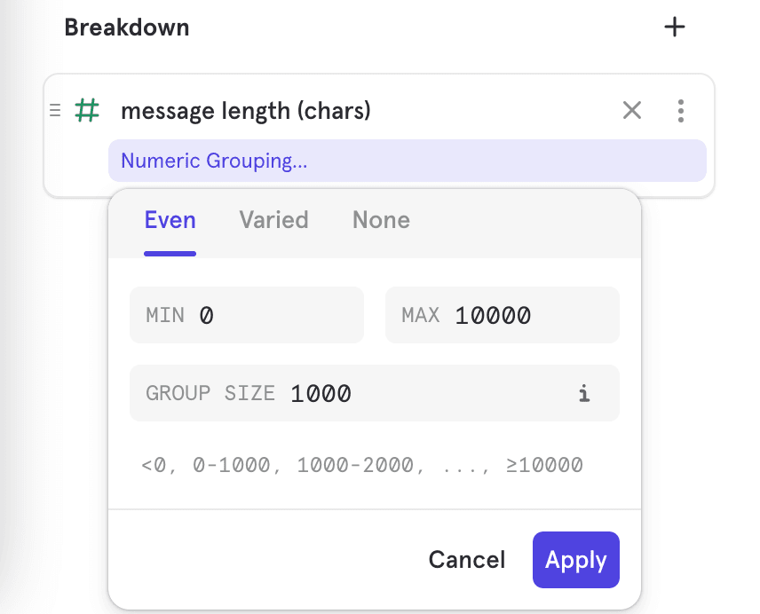
Custom Bucketing
Insights will automatically group your high-cardinality segments into buckets. Buckets can be edited by using the "Custom Buckets" option in the overflow menu: You can choose "Even" to get buckets of uniform size, and you can choose "Varied" to get buckets of different sizes. This helps with organizing outliers, or with drilling deeper into particular ranges.
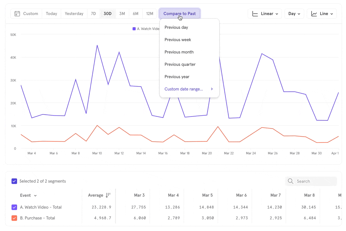
Time Period Comparisons
Compare the current period of time to previous periods to track trends and growth in your product’s use. Compare traffic from a specific campaign period or event from one year to the next, or compare the success of that campaign to your normal traffic.
Note that if a data point for a previous year falls on a weekend, the data point is automatically moved to the next Monday to give a clearer picture of the data change from one year to the next.
Click on the Compare to past button at the top of your Insights graph and select the time period you wish to compare to. You can also select a custom date range.
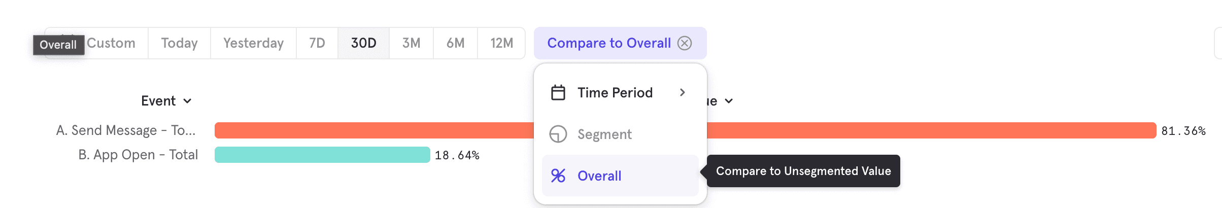
Value Comparisons
When you have multiple metrics, or have broken down a metric by a property, you can compare them against each and the relative value. Click on Compare -> Overall. This works for all measurements. For a "totals" measurement, you can see the percentage that a particular segment makes up. For non-sumable aggregations, it compares the segment value to the whole, unsegmented value.
Profile Analysis
Profile metrics allow you to access profile data and visualize your users with filters and breakdowns based on their profile properties. When exploring Profiles, you are always analyzing all user profiles. Select the Measurement you want to use to calculate results by clicking on Total and selecting an option from the drop-down. You can calculate based on users or profile property value.
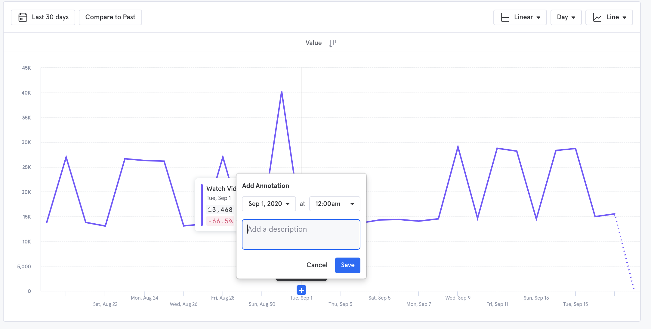
Annotations
To clarify the results in your Insights report, add detailed annotations directly to the line chart. Annotations are tied to a specific date on the chart, rather than a specific data point on the chart.
To add an annotation, hover your mouse over the point on the chart you want to annotate, and click the blue + button that appears. Enter a description for the annotation, such as a holiday that occurred on that day or the end date of your fiscal year, then click Save. If you accidentally selected the incorrect date on the chart, you can edit the date and time of the annotation in this window.
View an existing annotation by clicking on the number found at the bottom of a report. You will be able to see who submitted the annotation.
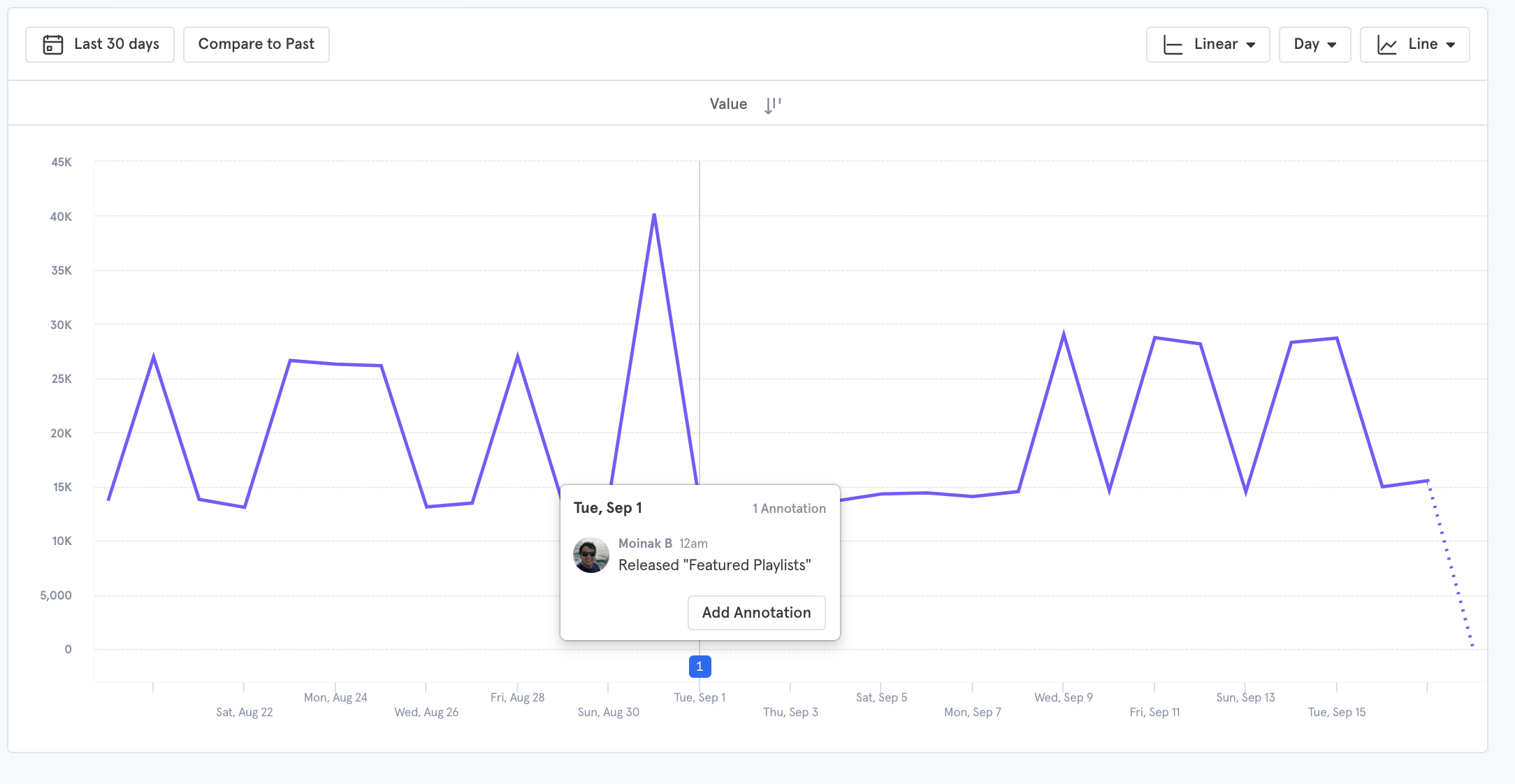
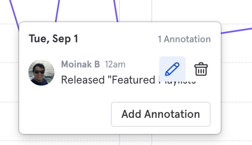
Hover the cursor over the annotation to edit or delete it. Click on the pencil icon to edit an annotation, or the trash icon to delete an annotation. Add additional annotations to the same date by clicking Add annotation.
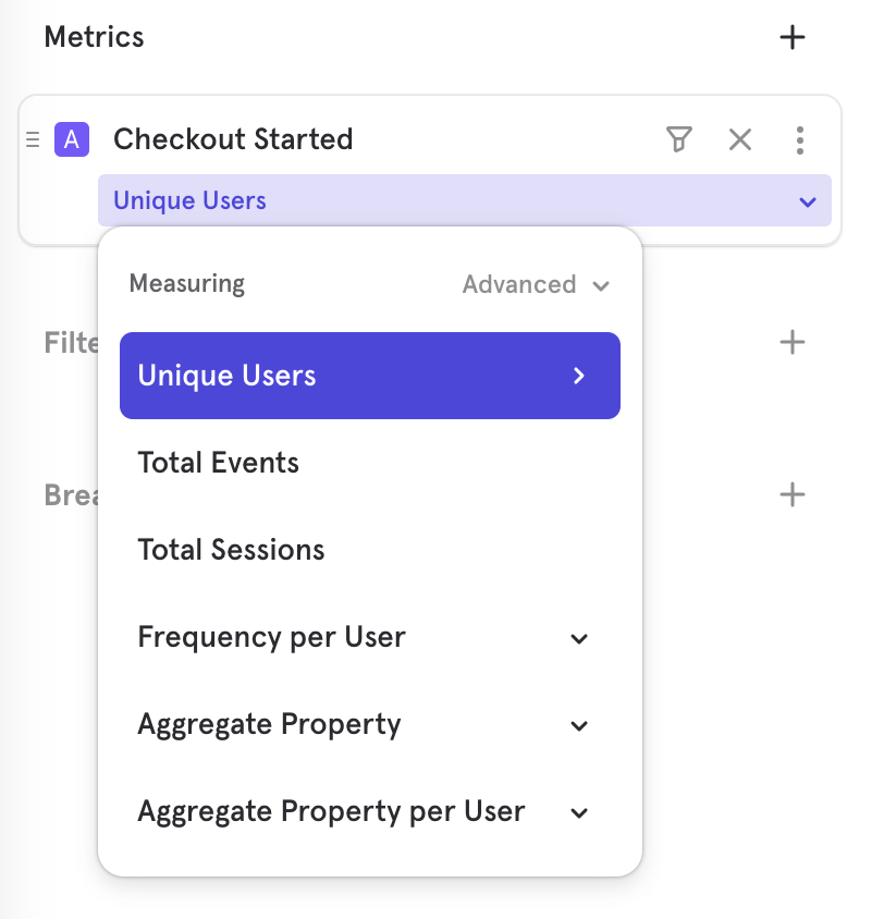
Measurements
Measurements in Mixpanel reports allow you to perform more complex calculations on your queries - this includes computing aggregate values of your event and property data, including totals, uniques, and averages.
The following measurements are only available in Insights, and are separated into groups based on what is being calculated: Total, Unique, Count users, aggregate property values, aggregate property values per user, and count sessions.
Select the measurement you want to use to calculate results by clicking on Unique Users and selecting an option from the drop-down. You can calculate based on events, users, event property value, event property value per user, and sessions.
The following functions have additional aggregation options which you will be prompted to select:
| Function | Aggregation options |
|---|---|
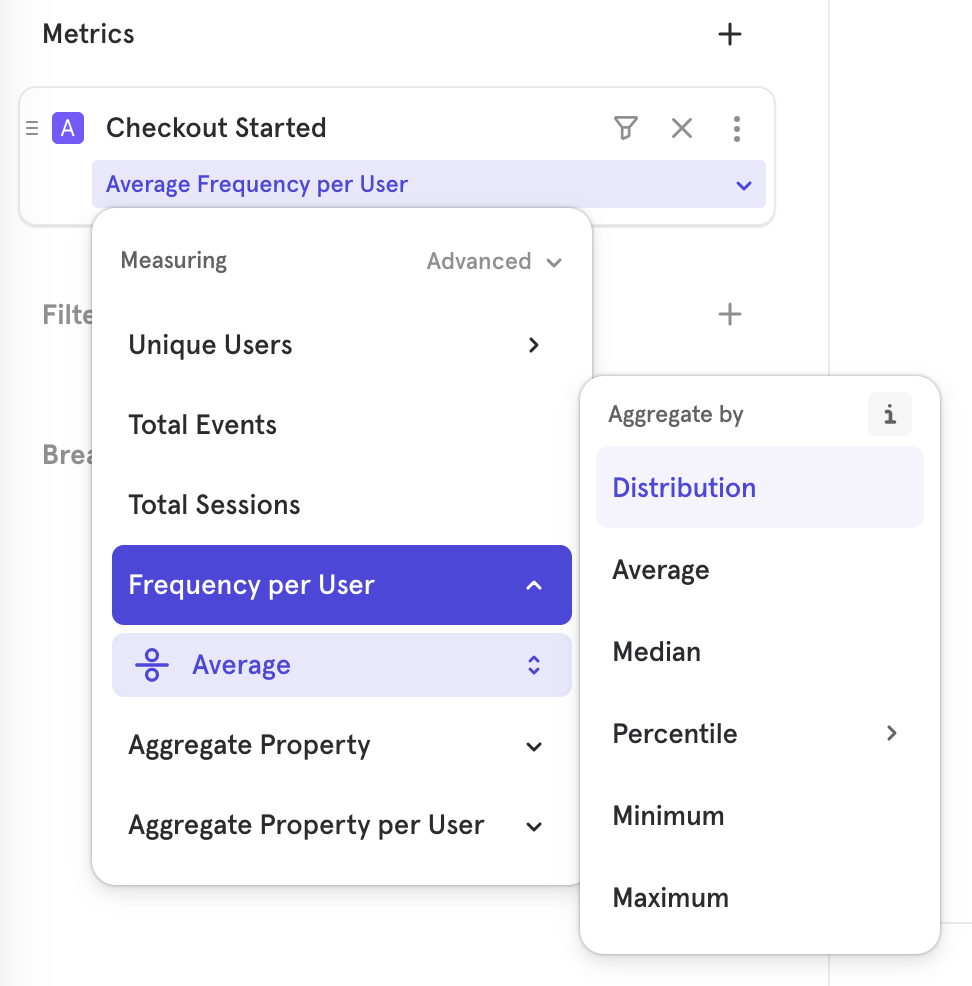
| Frequency per User | Total Per User |
| Aggregate Property | Sum Average Median Distinct Count (opens in a new tab) Percentiles (P25,P75,P90,P99) Minimum Maximum |
| Aggregate Property per User | Sum Average Distinct value count Minimum Maximum |
These functions provide additional aggregation options following the initial calculation because they are “per user” calculations. “Per user” calculations first calculate the value per user, which is an unhelpful query in its raw form, but becomes useful when you perform an aggregation on that calculation.
Selecting any of these functions gives you the option to choose different ways to aggregate this data. The default aggregation is Average, which you can click on to select a different option such as distribution, median, 25/75/90th percentiles, minimum, and maximum.
If the measurement you select calculates based on property (“Event Property Values” or “Event Property Values Per User”), you will be prompted to select an event property. You can find more information about each measurement and how they are calculated below:
Events
| Function Name | Events Calculation | Profiles Calculation |
|---|---|---|
| Total Events | Total count of [event] performed. Example: How many times did my users watch a video? | N/A |
| Frequency per User | The number of events performed per user. Example: How many videos were watched per user? Aggregation options: Average, distribution, median, percentiles, minimum, maximum | N/A |
Users
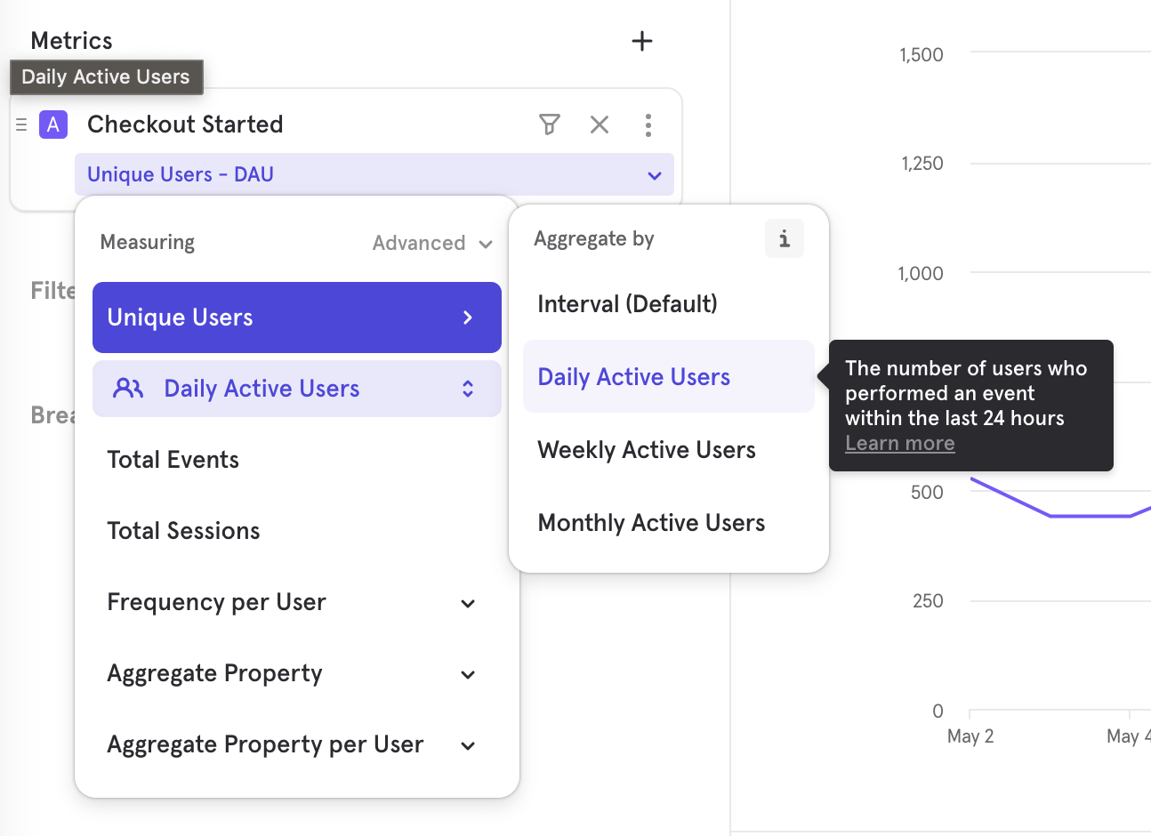
This can refer to measuring the total number of user profiles, as well as the number of unique users that performed an event. DAU, WAU, and MAU are accessed through the advanced settings of unique users. Select the > arrow to choose any XAU options.
If you select the DAU, WAU, or MAU function for a date range that includes the current day, the query will take the end of the current day as the end of the query’s time segment (even though it’s in the future). For example, today is April 25th, and it’s 4:22 PM. If you make a query to show WAU and you select “current day” as your date range, the query will return the count of unique users between April 19 at 12:00:00 AM and April 25 at 11:59:59.
| Function Name | Events Calculation | Profiles Calculation |
|---|---|---|
| Total | N/A | Total count of user profiles. Example: What's my total number of users? |
| Unique Users | The number of users who performed [event] or are a part of the cohort. Example: What's the count of users who watched a video? | N/A |
| Daily Active Users (DAU) | The number of users who performed [event] within the last 24 hours. Example: What's the count of users who watched a video on the last day? | N/A |
| Weekly Active Users (WAU) | The number of users who performed [event] within the last 7 days. Example: What's the count of users who watched a video in the week? | N/A |
| Monthly Active Users (MAU) | The number of users who performed [event] within the last 30 days. Example: What's the count of users who watched a video in the last month? | N/A |
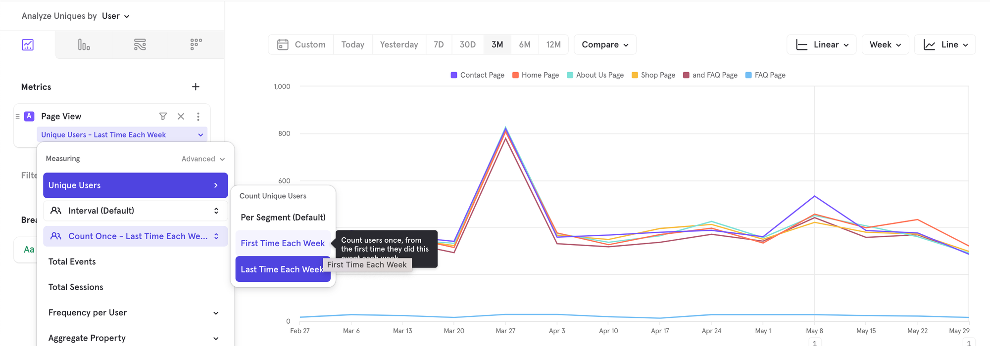
How do breakdowns work with Uniques?
When you apply a breakdown to a metric, by default, Mixpanel tells you how many unique users contributed to each segment. For example, in the image below, you can see there were a total of 2441 unique users, while the sum of individual segments is more than 3000. This is correct. That is because one user could have seen both a Home Page and a Shop Page, so they get counted as a user towards both segments.
By default, Mixpanel answers the question: per segment, tell me the number of unique users, DON'T tell me how the 2441 users are distributed across the various pages with a user being counted only towards one segment, which will require assigning a user to one segment even if they contributed towards multiple segments.
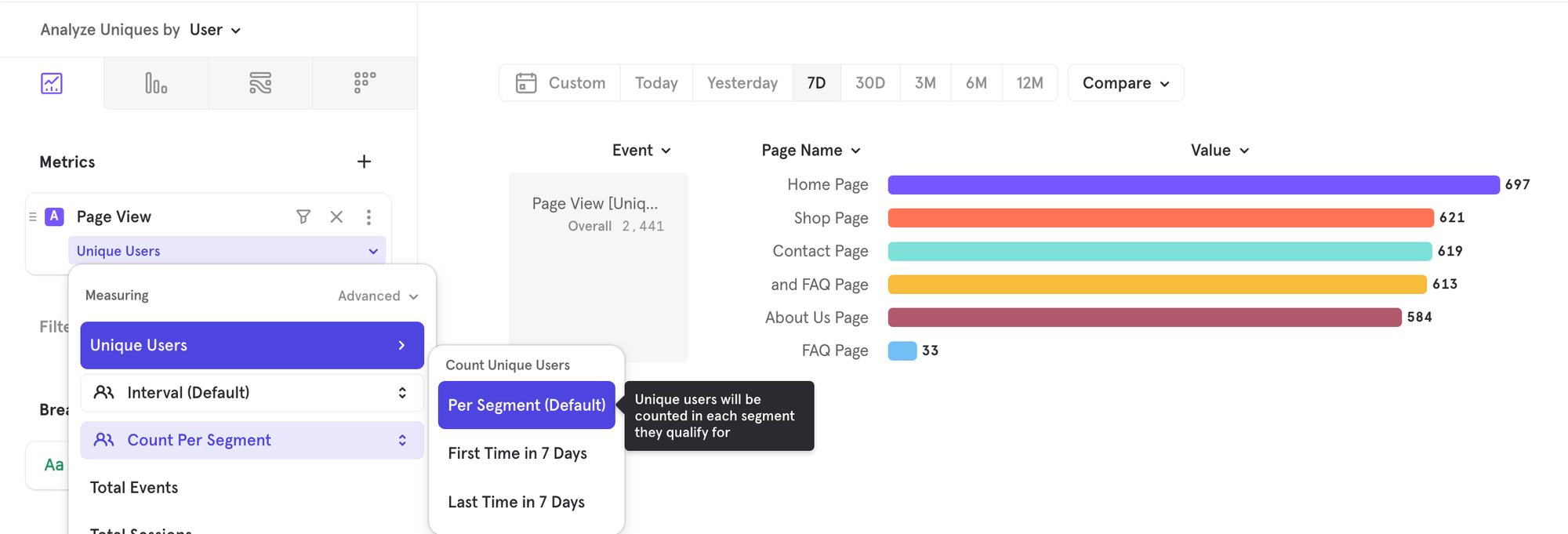
There are some cases though, where you want to know how the 2441 users are distributed, generally either by their first or last action. For example, based on the last page (segment) a user saw, tell me the distribution of users. You can enable this now via the advanced control for Uniques, by choosing which segment to associate a user to: either the first segment or the last segment in the chart date range (7D in the below image)
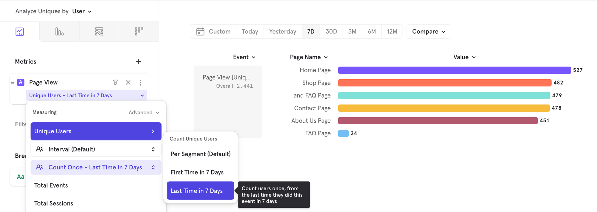
To note - in a line chart, there are two concepts of time period: chart date range (3M below) and time interval (weekly interval below). When advanced controls are used in a line chart, it assigns a segment based on the first/last segment for each time interval, NOT across all time intervals in the chart range. For eg. user Joey could count towards Contact Page Wk of Feb 27 and Shop Page Wk of March 6. But in the same time interval, they would count only towards one segment.
Aggregate Property
| Function Name | Events Calculation | Profiles Calculation |
|---|---|---|
| Sum | The total of a numeric property value across all instances of [event]. Example: What's the total number of minutes of videos watched? | The total of a numeric property value across all user profiles. Example: What's the total revenue across all users? |
| Average | Average of a numeric property value across all instances of [event]. Example: What's the average number of minutes per video watched? | Average of a numeric property value across all user profiles. Example: What's the average revenue across all users? |
| Distinct count | Calculates the unique count of property values across all instances of [event]. Example: How many unique songs were played in the last 30 days? | Calculates the unique count of property values across all profiles. Example: How many unique countries were our video watchers from? |
| Median | Median of a numeric property value across all instances of [event]. Example: What's the median number of minutes per video watched? | Median of a numeric property value across all user profiles. Example: What's the median revenue across all users? |
| Percentiles (25/75/90/99) | The 25/75/90/99th percentile of a numeric property value across all instances of [event]. Example: What's the 25th percentile number of minutes of videos watched? | The 25/75/90/99th percentile of a numeric property value across all user profiles. Example: What's the 25th percentile revenue across all users? |
| Minimum | Minimum of a numeric property value across all instances of [event]. Example: What's the minimum number of minutes per video watched? | Minimum of a numeric property value across all user profiles. Example: What's the minimum revenue across all users? |
| Maximum | Maximum of a numeric property value across all instances of [event]. Example: What's the maximum number of minutes per video watched? | Maximum of a numeric property value across all user profiles. Example: What's the maximum revenue across all users? |
Aggregate Property per User
| Function Name | Events Calculation | Profiles Calculation |
|---|---|---|
| Sum | The total of a numeric property value across all instances of [event] per user. Example: What's the total number of hours of videos watched per user? Aggregation options: Average, distribution, median, percentiles, minimum, maximum | N/A |
| Average | Average of a numeric property value across all instances of [event] per user. Example: What's the average number of hours of videos watched per user? Aggregation options: Average, distribution, median, percentiles, minimum, maximum | N/A |
| Distinct count | The number of distinct property values per user. Example: How many different videos did each user watch? Aggregation options: Average, distribution, median, percentiles, minimum, maximum | N/A |
| Minimum | Minimum of a numeric property value across all instances of [event] per user. Example: What's the minimum number of hours of videos watched per user? Aggregation options: Average, distribution, median, percentiles, minimum, maximum | N/A |
| Maximum | Maximum of a numeric property value across all instances of [event] per user. Example: What's the maximum number of hours of videos watched per user? Aggregation options: Average, distribution, median, percentiles, minimum, maximum | N/A |
Total Sessions
| Function Name | Events Calculation | Profiles Calculation |
|---|---|---|
| Sessions with event | The number of sessions that contain [event]. Example: What's the total number of sessions in which users watched a video? | N/A |
Additional Aggregation Option Examples
| Measurement | Average | Distribution | Median | Percentiles (25/75/90) | Minimum/Maximum |
|---|---|---|---|---|---|
| Total per user | What's the average number of songs played per user? | What is the distribution of my users by the number of songs played? | What's the median number of songs played per user? | How many songs did the 90th percentile user listen to? | How many songs did my least/most active user listen to? |
| Sum of property value count per user | What's the average cumulative watch time per user? | What's the distribution of my users by the cumulative minutes of content watched? | What's the median of the cumulative watch time per user? | How many cumulative minutes has the 90th percentile user watched? | How much has the lowest/highest spender spent? |
| Average of property value count per user | What's the average of the average cart value for each rider? | What's the distribution of my users by the average cart value per user? | What's the median of the average cart value per user? | What's the average cart value for the 90th percentile user? | What's the minimum/maximum average cart value? |
| Distinct property value count per user | What's the average number of unique song titles heard by my users? | What's the distribution of my users by the number of unique song titles listened to? | How many unique songs does the median user listen to? | How many unique songs does the 90th percentile user listen to? | What's the minimum/maximum number of unique songs my users listen to? |
| Minimum property value count per user | What's the average of the minimum ratings provided per user? | What's the distribution of my users by the minimum rating provided? | What's the median of the minimum ratings provided by users? | What's the minimum rating provided by the 90th percentile user? | What's the minimum rating across all ratings?? |
| Maximum property value count per user | What's the average of the maximum gaming session length per user? | What's the distribution of my users by the maximum gaming session length? | What's the median of the maximum gaming session length per user? | What's the maximum gaming session length provided by the 90th percentile user? | How long has the longest gaming session lasted across our users? |
Here's a quick overview on "Distinct count" of property values, and how that differs from "Distinct count" of property values per user:
Here are some use cases that are now possible with "Distinct count" of property values:
- How many unique items were added to cart yesterday?
- How many unique songs/videos were played in the last 30 days?
- How many unique files were worked on in the last week?
Analysis Settings
Allows you to change the metric being measured. Access by going into the advanced section of the measurement menu.
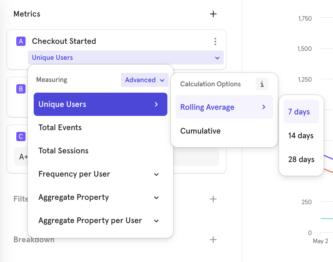
- Rolling Average: Rolling analysis calculates the rolling average of the data set. A rolling average curve is a series of averages from subsets of data. Use rolling average analysis to remove noise or spikes from data and smooth out trends over time. Mixpanel calculates the rolling average based on the selected time interval (hour, day, week, month, or quarter) for each data point in the graph.
For example, if you make a rolling analysis query for the past 30 days, Mixpanel calculates the rolling 7-day average by default. The value reported on each day in the line graph is the average of the values from the 7 days leading to that day. In the case of the first 6 days in your selected time period, the 7-day-average calculation will include days before the selected time period. - Cumulative: Adds up the values of each point on the graph as it goes along, so the height of the line will increase over time.
View Users
Click a segment in an Insights report to see the list of users that underlie that data point. This helps see a representative sample of users from any analysis, so you can drill into anomalies or simply get to know your users. You can also save this user list as a cohort to either export or use for message targeting.
See this video walkthrough (opens in a new tab) for examples of how View Users can help you understand users contributing to a specific metric.
View Events
Click on a chart segment in Insights and view the raw events that made up that metric. You will be redirected to the Events page.
View Sample Events
You can hover over any event and in the context panel, you now have the ability to "View Sample Events", which redirects you to the Events page with the 100 most recent samples of that hovered event: You can see a few samples of an event to help you decide whether that's the right event you want for your analysis or which property you should use for filters/breakdowns.
Was this page useful?