Advanced
Query Builder Features
Session Metric Analysis
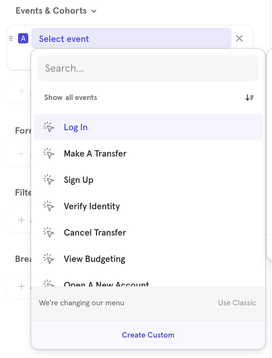
Analyze session metrics by selecting "Session Start" or "Session End" from the events list. Learn more about using Sessions in Insights, Funnels and Flows here.
Inline Filtering
Filter this event by clicking the inline action menu and selecting Add filter from the drop-down. Choose an event property, user profile property, group profile property, or cohort to filter the event by.
You can select whether you would like your query to match any or all of the filters by clicking on and/or beside the filters.
Duplicating Events
To duplicate any events or properties in your query, select the inline action menu and choose Duplicate. Delete any events or properties by clicking the trash icon.
Advanced Date and Time Selectors
You can also choose how Mixpanel buckets the time range in Insights, Funnel Trends and Retention Trend reports (granularity may vary). To view a range in hours, you can select Hour as the view:
To zoom in, click on the graph and drag to highlight a specific window of time in your report. Click Reset zoom to return to the previous view.
Advanced Filter & Breakdown Usage
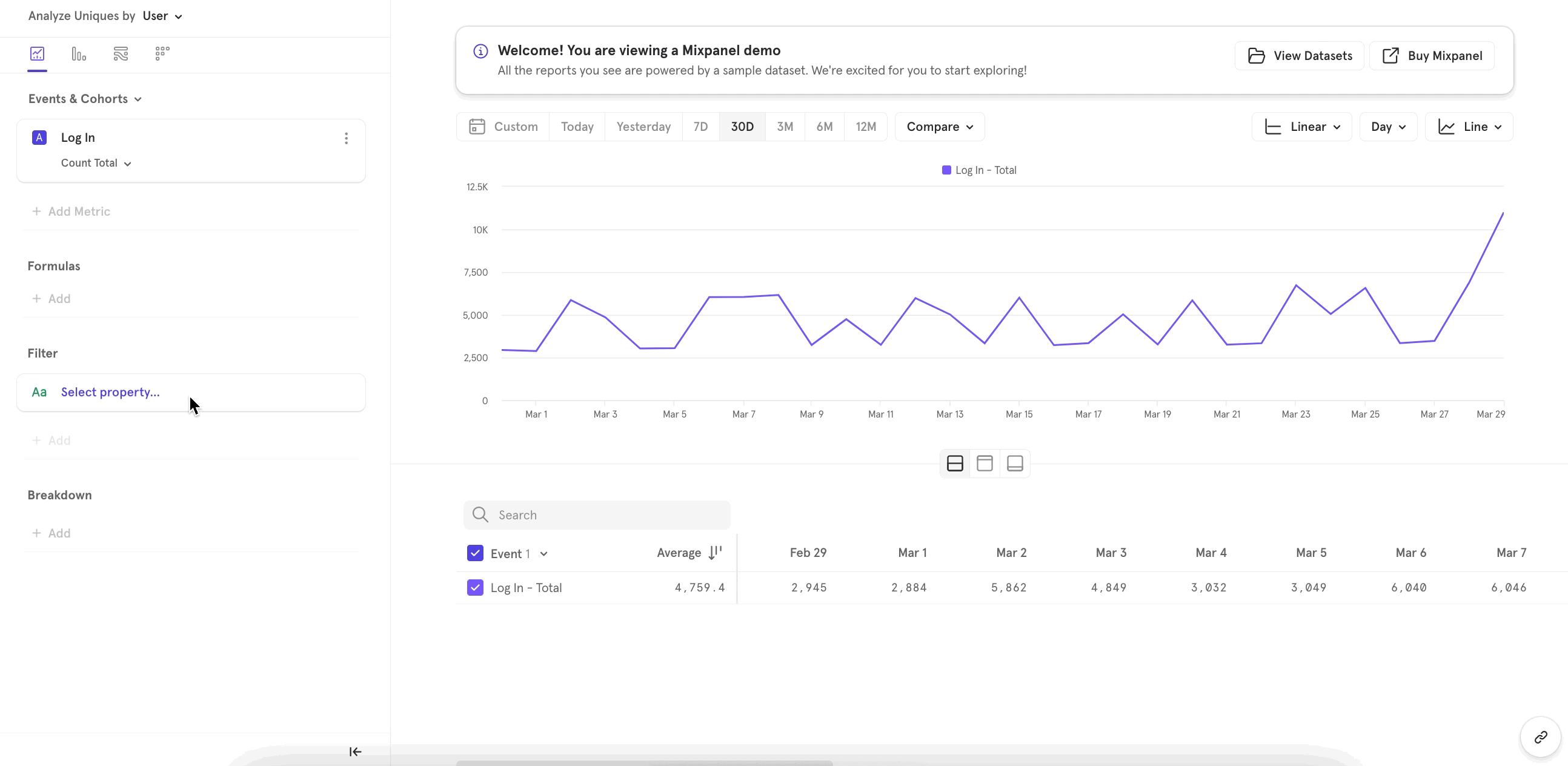
To filter the results of your report by any property or cohort, click the Filter button.
To break down your results of your report by any property or cohort, click the Breakdown.
You can break down your results by the "Time" event property and breakdown by Hour, Day, Week, Month, Quarter, Year, Hour of Day, or Day of Week.
If you are analyzing any custom events, you can breakdown by the property "Event Name".
The drop-down menus only show events/event properties that were ingested within the last 30 days. To select events/event properties that have not been ingested in the last 30 days, type the name of the event/event property in the Filter or Breakdown search bar. You must know the exact name of the event/event property you want to select because event names are case sensitive.
To create a temporary cohort for the current report, click Create Custom... in the dropdown menu and select "Cohort. A window will pop up where you can specify the restrictions of your cohort. Learn more about building a cohort here.
Slack Integration
Connect Mixpanel to your Slack workspace to help share reports with your colleagues faster. You can (1) set up an alert to send a message to a Slack channel, (2) set up a Board Subscription to send a message to a Slack channel, or (3) share previews of any Mixpanel report in Slack.
To send an alert to a Slack Channel, see Custom Alerts. To set up a board subscription to a Slack Channel, see Advanced Board Functionality - Subscriptions.
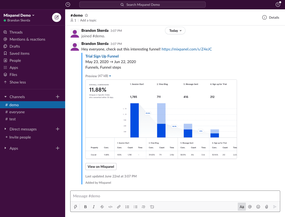
The Mixpanel application for Slack will also automatically unfurl a preview of any Mixpanel link, including chart images for certain reports, making it easy for anyone in your Slack workspace to learn from your Mixpanel analyses.
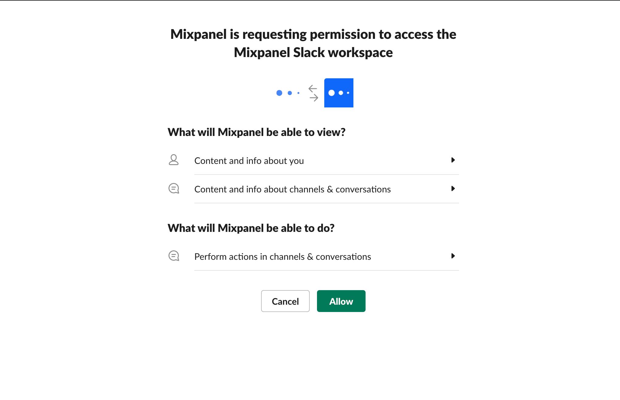
Enable the Integration
To enable the integration, log in to both Mixpanel and Slack, then click here (opens in a new tab) to authorize the slack workspace:
After clicking allow, you'll return to Mixpanel, where you'll see a success banner:
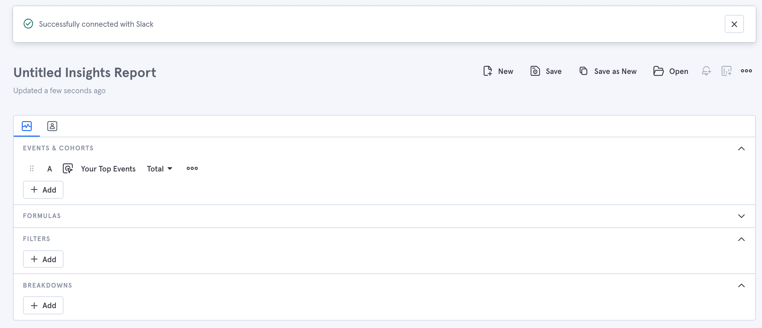
At this point, Mixpanel is a part of your Slack workspace, and any Mixpanel links you send in Slack will unfurl with metadata, and if applicable a chart preview.
Once at least one member of your Mixpanel organization has set up the Mixpanel Integration for Slack for their account, any other members of the Slack workspace will see a prompt the next time they paste a Mixpanel link. The prompt will ask them to connect their own Mixpanel account to Slack as well. If they choose to do so, Slack will guide them through the authentication flow. Once they have successfully connected Mixpanel to Slack, any further links they paste in Slack will unfurl.
Using the Integration
Once you've set up the integration, Mixpanel links pasted in Slack will unfurl. Most links will provide some basic link metadata, and links to Insights, Flows, Funnels, or Retention reports will also include a chart preview, for example:
Permissions
Mixpanel does not restrict who can enable the Mixpanel integration for Slack. However, your Slack workspace may limit who can perform the connection.
After Mixpanel is connected to Slack, any Slack user who posts a Mixpanel link will be prompted to connect their own account, in order to unfurl report previews. By performing this integration at the user level, it ensures that only reports the user has access to will unfurl in Slack.
Privacy
The Mixpanel app for Slack adheres to Mixpanel's overall privacy policy, available in full here: https://mixpanel.com/legal/privacy-policy/ (opens in a new tab).
Custom Buckets
Custom buckets lets you group existing properties into meaningful segments on the fly. This is focused on enabling every person to answer common segmentation questions easily, quickly and in a low friction way.
Example use-cases include:
- Compare how the core markets are performing between US vs UK vs China vs all others
- Compare how many sign-ups are brought in by organic search vs Google ads vs social media channels together (Facebook, Twitter, LinkedIn)
- Compare # videos watched for users between ages 18-30 vs 30-40 or 40+
- Compare # users based on duration of video watched: < 30, 30-60, 60-90 mins
Creating Custom Buckets
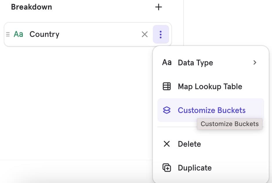
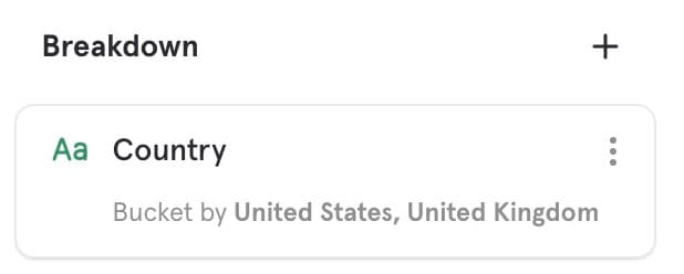
Add a property in Breakdown, then select the Customize Buckets option from the overflow menu
Depending on your added property data type - string vs numeric, you will see a different custom buckets modal, designed based on the data-type use-cases (more detail below)
Once you define your segment buckets, click Apply. Only then will the custom buckets reflect in the visualization. You will also see the custom buckets as an under-item on the property
To modify the segment buckets, click on the under-item and the custom buckets model will open. Once you’ve made the changes, click Apply
To remove all grouping and revert to the default, open the custom buckets modal and click Reset
String property Use Cases
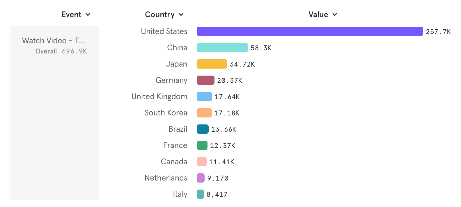
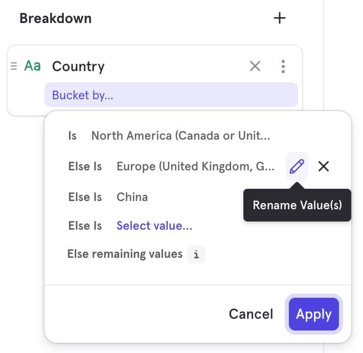
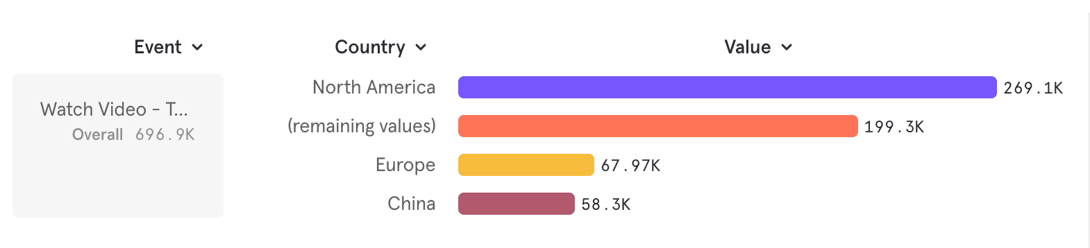
Use Case: You want to compare # videos watched between core markets - North America, Europe & China
Current: You have a property “Country”
Goal: You want to group the countries into meaningful segments
- Segment 1: North America: US & Canada
- Segment 2: Europe: UK, Germany, France, Netherlands, Italy
- Segment 3: China
- Segment 4: Rest of the World (everything but those above)
Steps
-
Add a breakdown - Country. Below is the default you’ll see
-
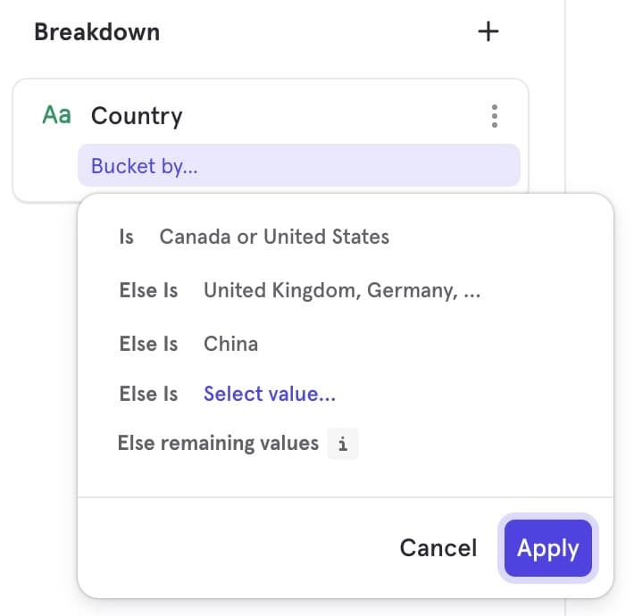
Choose to bucket segments, by opening the custom buckets model and click Apply
- For each segment, choose the operator “is” and select one or more values
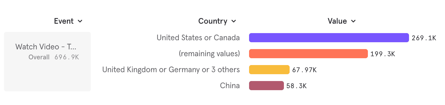
- “Rest of the World” is auto generated as remaining values
- To note — if two segments have the same value, the first segment will consider the value. Custom buckets are non-overlapping and sum up to 100% by definition
You can also re-name these segments to make them meaningful to you
- On the same line of the segment, choose to rename it using the pencil icon
- Click Apply after creating and naming your segments as desired
Numeric property Use Cases
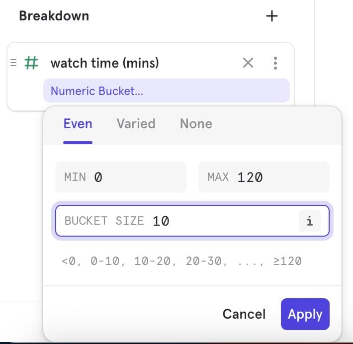
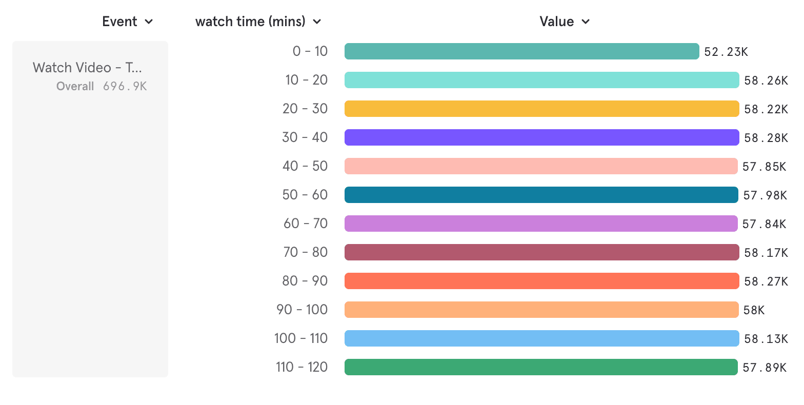
Use Case: You want to compare #users based on duration of video watched
Current: You have a property “watch time (mins)”
Goal: You want to distribute this in various ways
- Use Case A: Evenly in 10 min groups for the range 50-100 mins
- Use Case B: Specific groups <10, 10-20, 20-50, 50-100, ≥100
- Use Case C: Want to see all the durations as-is (No grouping)
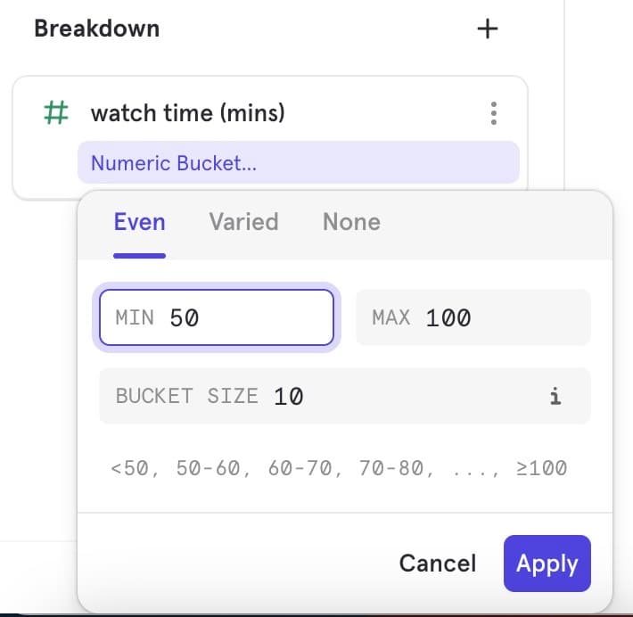
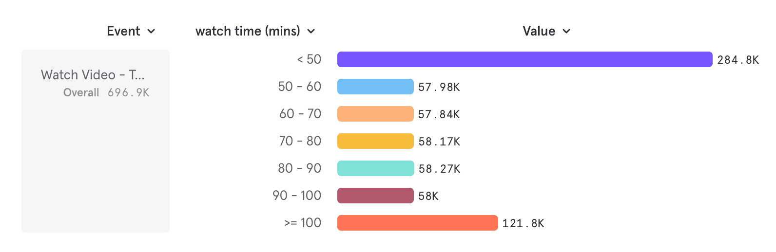
Deep Dive: Use Case A: Evenly in 10 min buckets for the range 50-100 mins
-
Add a breakdown - “watch time (mins)”
-
To note — every numeric property is auto-bucketed into even sized buckets as the default
-
Here the default seems to be even buckets of 10 mins across the range
-
-
Go to the overflow and open the custom buckets modal
-
Since looking for even buckets of “30 mins”, choose Even Bucketing
-
Modify the min and max values of the desired range, and the bucket size, and click apply
-
To note — both a lower end and upper end bucket will be auto-generated to ensure your breakdown always adds up to 100%
-
Here these buckets are <50 mins and ≥ 100 mins
-
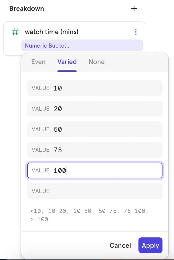
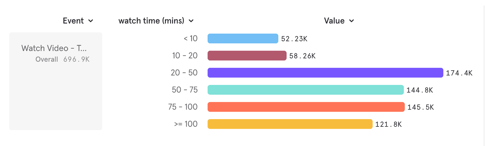
Deep Dive: Use Case B: Specific groups <10, 10-20, 20-50, 50-100, ≥100
- Open the custom buckets modal
- Since looking for specific buckets with varied bucket ranges, choose Varied Bucketing
- Enter the ‘segment’ break point values in each row and click apply. You can preview the bucket as you enter values in the line-item below
- To note — both a lower end and upper end bucket will be auto-generated to ensure your buckets always adds up to a 100%
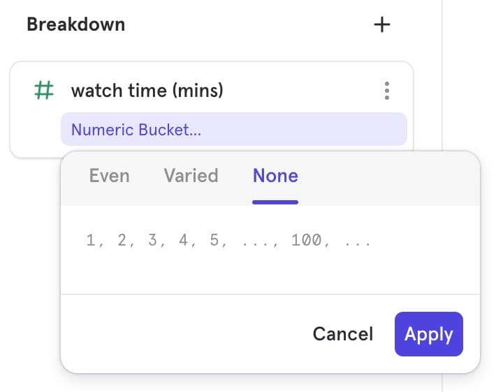
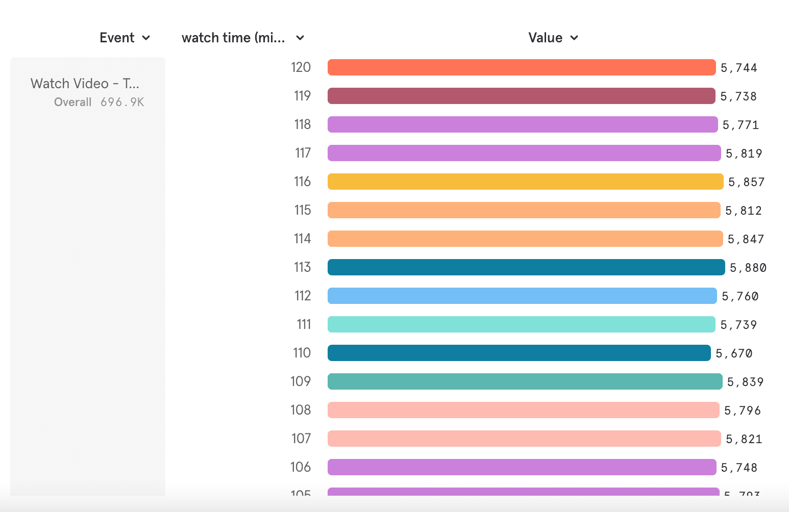
Deep Dive: Use Case C: Want to see all the durations as-is (No bucketing)
- Open the custom buckets modal
- Since looking for “No bucketing”, choose None — This lays out all the numeric property values as-is
Typecasting property Use Cases
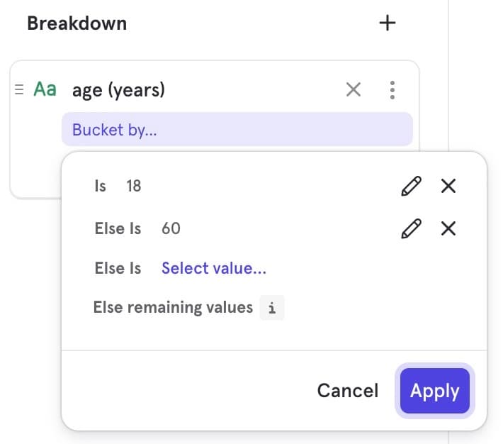
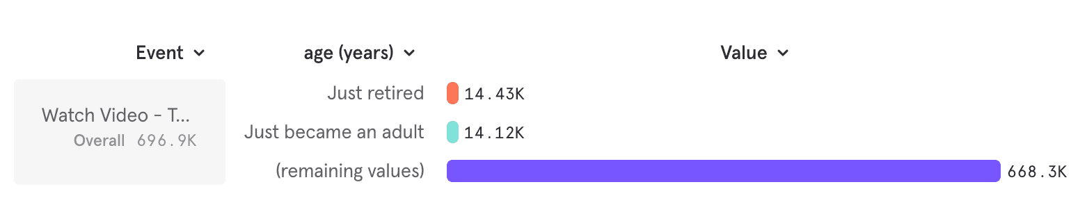
Use Case: You want to identify #users of age 18 and age 60 since these are user ages where they change subscription plans (upgrade and downgrade respectively)
Current: You have a property age (years)
Goal: You want to group this in a meaningful way
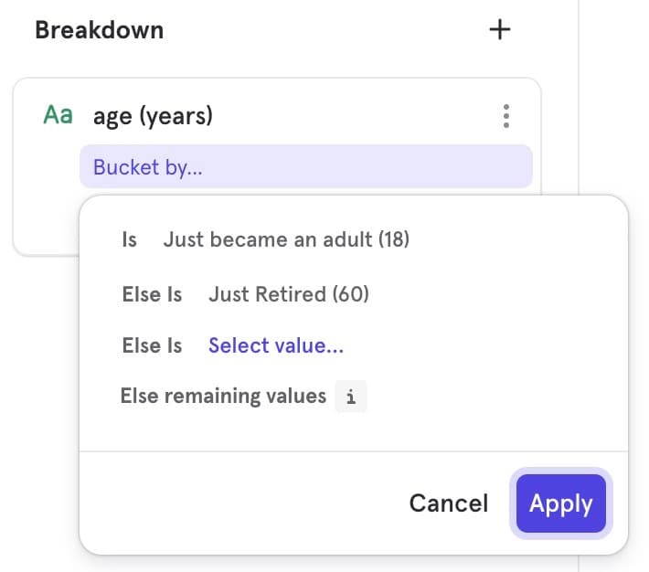
- Segment 1: Age 18 (potential to upgrade)
- Segment 2: Age 60 (potential to downgrade)
- Segment 3: Every other age
Steps
-
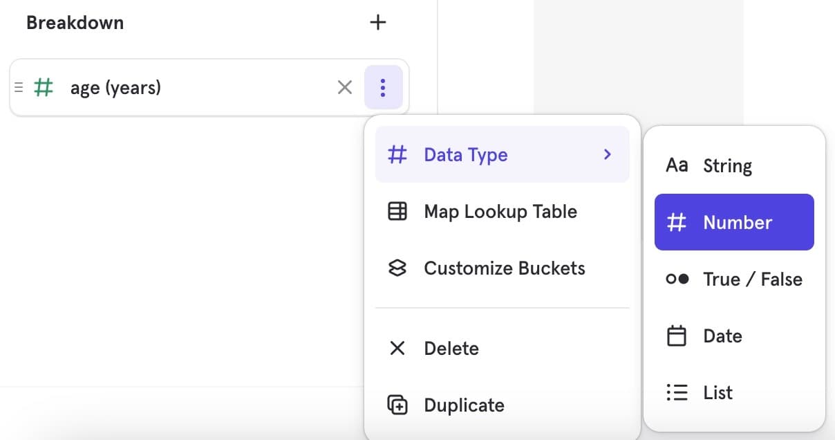
Add a breakdown age(years). By default this will add as a numeric property
-
Since you are looking for pin-pointed years and not creating number-ranges, this is a question more common to string property data type
-
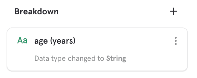
Change Data Type of age(years) to String. Once changed you will see the type-casted property type as an under-item
-
To note - only type-casted data types show as an under-item. If the data-type was the same as ingested, no under-item for data type will be seen
-
-
Post changing data-type, open the custom buckets modal. This will now open a modal meant for string property data type
-
Follow steps as elaborated for String property use-case above, and achieve the goal
FAQ
-
Which reports does Custom Buckets work on?
This feature is available in the Insights, Funnels and Retention reports.
-
Which property types does this support?
Custom Buckets work on String, Numeric and List data type
-
Can I save a Custom Bucket?
No, you can’t save a custom bucket. If your custom bucket is something you or your team would like to re-use, we encourage you to instead create a custom property.
-
How is custom buckets different from custom property?
Custom buckets only supports the most common custom-property use-case of
if elseto create meaningful segments in a more simplistic UI, and a low lift way to enable quick ad-hoc exploration. You could get this same answer using custom property too, it would just be more effort and not as intuitive -
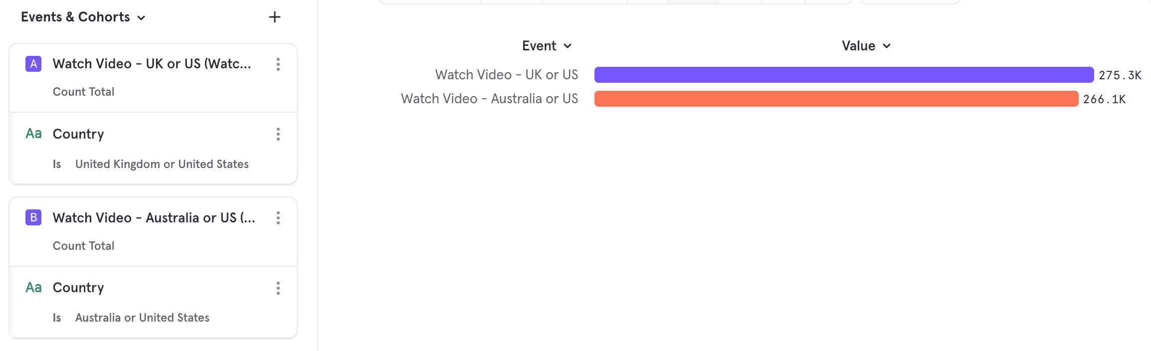
Can I create over-lapping segments like (US & UK) vs (US & Australia)?
No, breakdowns are fundamentally designed to sum up to 100%. To ensure your analysis is accurate, please create non-overlapping segments.
If you really need to answer a question like this, the right way here is to create these as two metrics leveraging inline filters and NOT use breakdowns.
-
What happens if I change data-type, can I still use custom buckets?
Yes you can as long as the data-type you’ve changed the property to is supported.
-
Understanding the details:
-
In Numeric: Can I change the operators on the upper and lower bound?
No, the operators have been fixed. The lower bound is always strictly greater than (≥) and the upper bound is just lesser than (<). If you are looking for more control on the operators, please create a custom property.
-
In String: Is (not set) included in (remaining values)?
No, (not set) is not included in remaining values
- (remaining values): refers to ‘set’ values that just don’t fall into any of your defined segments
- (not set) refers to the events where a property value has not been set at tracking/ ingestion. For example a new video (MixFun) is has been added. But during tracking, you forget to send the name of this video. So the count of this video is being tracked, but it’s being associated to a property value (not set) vs (MixFun)
More details can be found in this help doc
-
In Numeric: What is the difference between (not set) and (non-numeric values)?
- (not set) as explained above for string refers to property values that have not been associated to any specific property value
- (non numeric values) refers to set values that have just been sent in as non-numeric data type. For example, you’re looking to track time spent and have coded that as a numeric property, but for some reason some values are tracked as “a”, or “b” which are not-numeric.
-
-
Some Common How-do-I(s)
-
How do I know is set, (not set)?
(not set) is automatically computed and will always show up in the UI. You don’t have to select (not set) as a segment to know how many events fall in there. So only figure how would you like to segment your (set) values.

-
How do I get "not contains" or "not equal to"?
These values will auto-generate under (remaining values). So just select what should be included
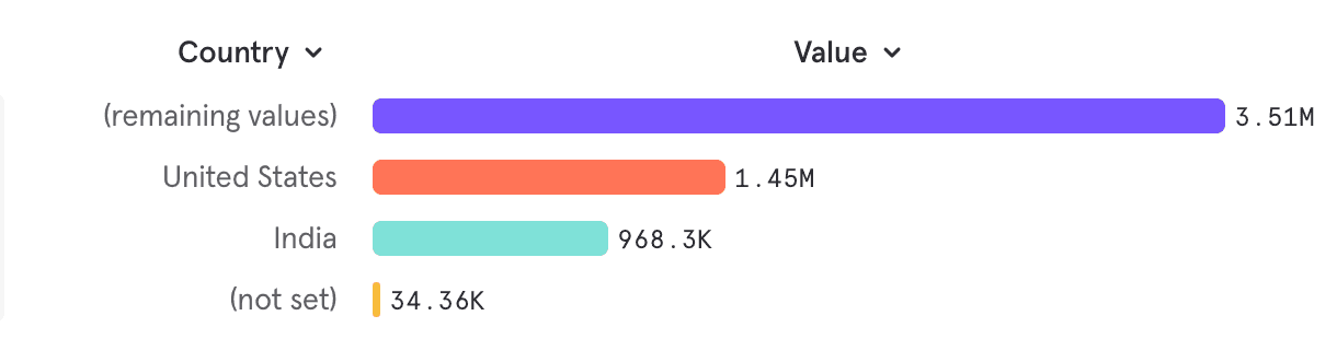
For example — the (remaining values) below is not equal to US or India
-
In Number: how do I get a bucket of just 0?
If you’re purely looking for just how many people have value “0”, we would encourage you to typecast this to a string property and get that.
If you’re looking to get the count of 0, in reference to the other numeric buckets, go ahead and create a Varied Bucketing custom buckets modal
- If the numeric values are integers:
- Choose Varied bucket values 0, 1, 2…
- This would generate buckets: <0, ≥0 & <1, ≥1 & <2, ≥2.
- ≥0 & <1 would be equal to bucket 0
- If the numeric values are decimals:
- Choose Varied bucket values 0, 0.0001, 1, …
- This would generate buckets: <0, ≥0 & <0.0001, ≥0.0001 & <1, ≥1.
- ≥0 & <0.0001 would approximate to bucket 0
- If the numeric values are integers:
-
View Users
View Users is a streamlined process for exploring the users contributing to a specific metric or point on a chart. By interacting with the chart, you can view a group of users experiencing friction or dig deep into which users are driving feature adoption.
View Users can help you:
- See the users contributing to any metric and view their recent activities & properties.
- Save these users as a cohort.
- Export these users to a CSV file.
Insights
- To learn more about your users who recently Signed Up at a specific point in time, you can click any point on a chart or line to access View Users. The View Users overlay displays the list of users contributing to your chosen point on the chart.
- By clicking on one of these users, you can further explore their User Properties like experiment group, purchase count, last event and many more.
- While viewing a specific user, you can also discover their recent activities (*Like, Comment, Message Sent, Ad Conversion,* etc) after Sign Up through the Activities menu.
Funnels
- Finding the exact group of users who dropped off after Sign Up is possible through View Users in Funnels. While in a Funnels report, click on the section of the chart that displays non-converting users and select View Users - this displays the list of those who didn’t convert after signup.
- Save this group as a cohort by clicking the Create Cohort button. Now, you can learn more about their product usage or find the root cause of why they didn’t convert after Sign Up.
Retention
- View Users in Retention report presents you with two options - view retained users and view dropped off users. This is helpful to find the specific group of users who were engaged or dropped off after Sign Up over a period of time.
- Export your group of choice to a CSV with one click. This data can guide meaningful actions, like emailing your user group a note that helps them get unstuck and engaged.
Keyboard Shortcuts
Undo / Redo Shortcuts
Undo / redo shortcuts allow for fast adjustments to your analysis. Cmd + Z to undo; Cmd + Shift + Z to redo. Change filters, date ranges, line vs bar chart, and go back in one second to compare before and after, or fix the view.
- Navigate different report versions: add a new event, filter or breakdown and undo that change with
Cmd + Z. This makes iterating between different versions of your report quick and easy. - Compare visualizations: go from a bar chart, to a line chart, to a pie chart and all the way back while only using the undo / redo keyboard shortcuts.
Comparison: Time, Baseline and Overall
Once you have visualized a metric you are interested in, you want want to compare it against related metrics to gain further insight. Previously, only comparing against past values was supported, but there are now 3 different ways to compare your metrics. The ability to do and show comparisons across segments is also supported in Boards, so any report saved will also reflect in Boards.
Time Comparisons
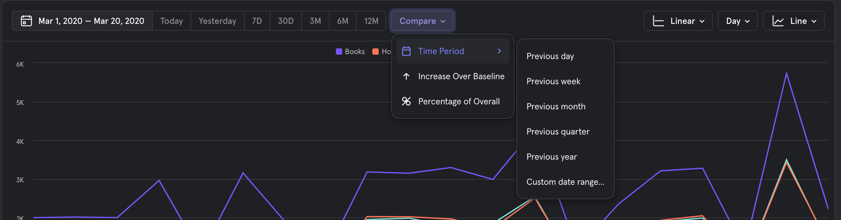
The compare to past menu has been modified to include the new comparison options, but users can continue to find the same time comparison options that existed before under the new "Compare" menu.
Time Comparison - Absolute Values
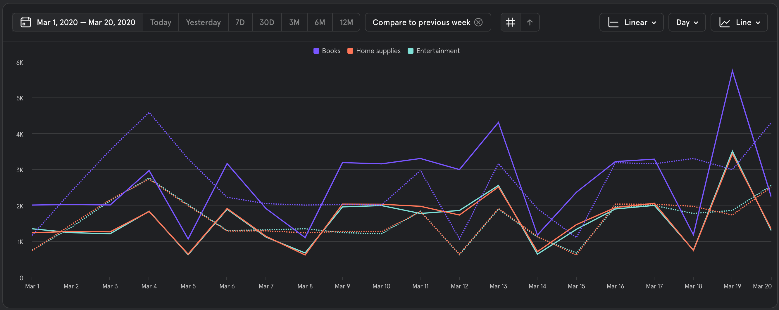
This is the same default behavior that existed previously. When you compare to a time period users will see a solid line for the present data, and a dashed line for data in the time comparison period.
Time Comparison - Percentage change over Baseline
This can be activated by selecting the "Percent change over Baseline" option in the controller next to the comparison menu.
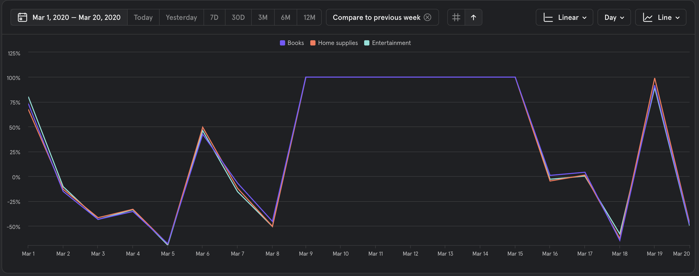
When this view is activated, users will see the percentage difference from the one time period to another. This is the same value that was shown in the tooltip, but now users are able to show how segments are shrinking and growing over time. This also makes it easier to see relative performance between different segments.
These values are also reflected into the segmentation table below the chart.
Increase over Baseline
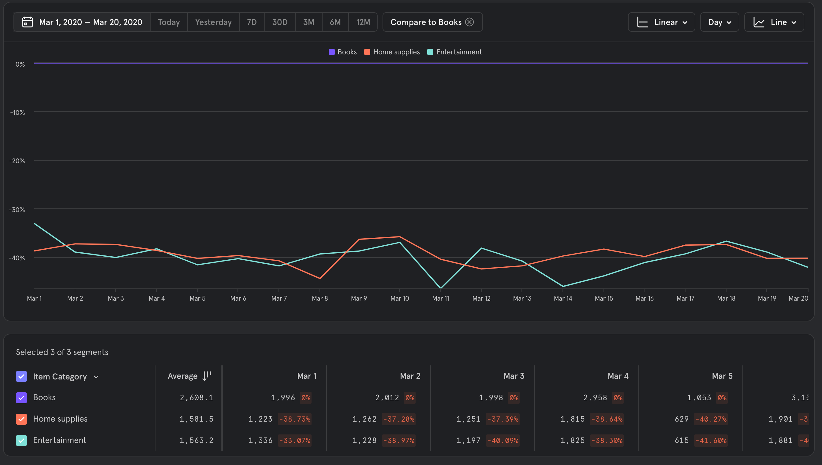
Another comparison type that is now natively supported in Mixpanel is the ability to set a segment as a baseline from which other segments are compared against. This allows users to compare different segments across the same time period.
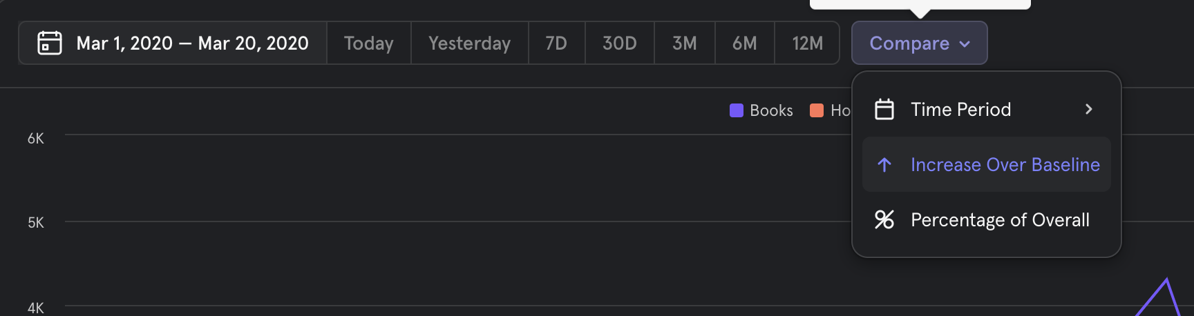
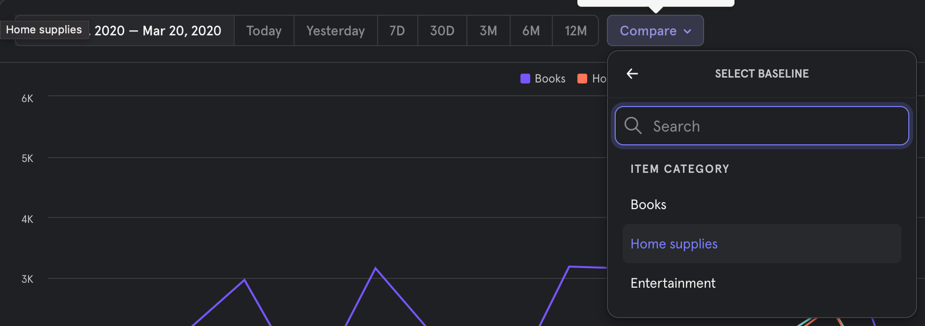
To enable, choose the "Increase over Baseline" option in the compare menu, then choose the segment that you wish to be the baseline.
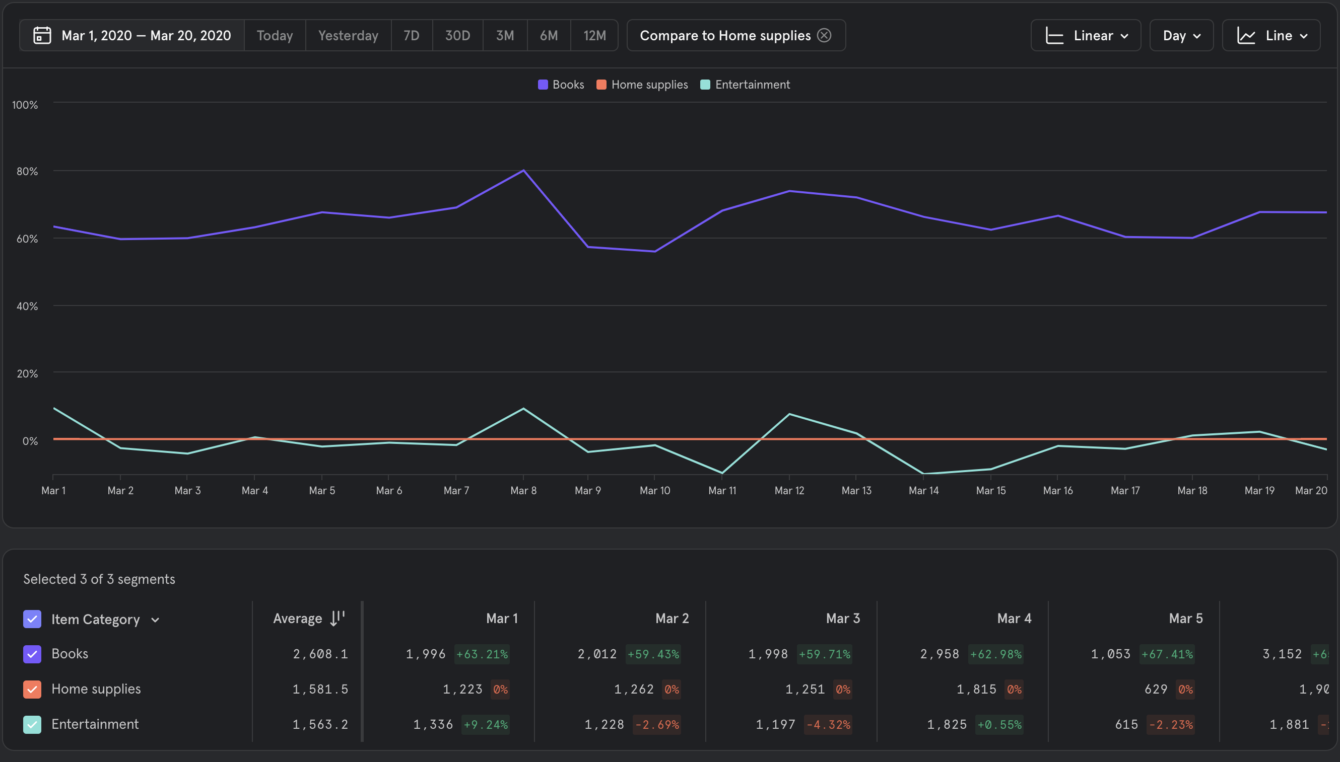
Notice that because "Home supplies" is chosen at the baseline, it appears on the chart as a flat 0 line - this is because "Home supplies" always has a 0% difference against itself in the same time period.
Also note that the y axis can go below 0, because segments can perform better or worse than the selected baseline, like "Entertainment" above.
Percentage of Overall
This option allows users to see how segments perform as a percentage of the total. Mixpanel will proactively disable this option when this comparison option won't give meaningful results.
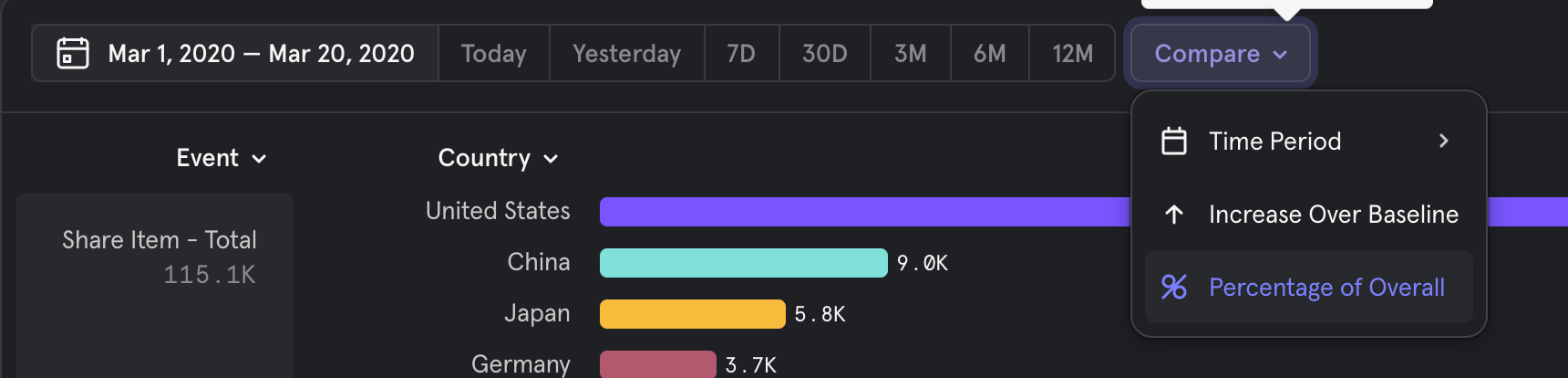
To enable, open the Compare menu and select "Percentage of Overall"
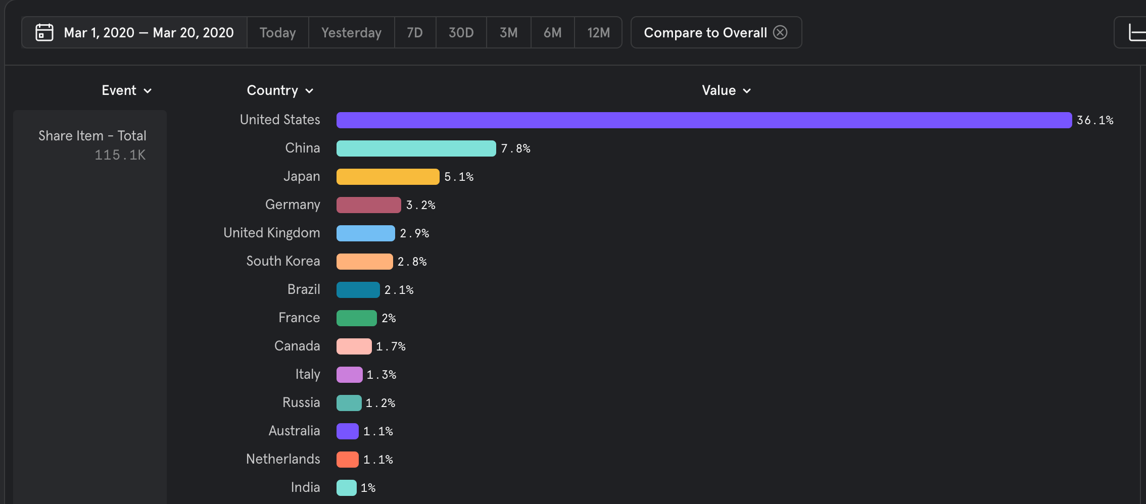
Why do the values in Compare to Overall not add up to 100%?
Depending on the type of metric, the percentages may not add up to 100%. This is because the value is being compared to the unsegmented value. For example, if you were you segment Total "Add Item to Cart" events by "Category", then the values should sum up to 100%, since an item might not be a part of different categories.
However, if the metric was "average price", then the average price across all categories might be $10. Within individual categories, the average price might be lower or higher, and that is the comparison being done by "Compare to Overall". In this case the percentage values would not add up to 100%.
More generally, if the metric is summable, and the groups are mutually exclusive, then the percentages will add up to 100%. if the metric is a non counting metric like uniques, or percentile aggregation, the percentages will not add up to 100%. Another example is if the breakdown is by cohorts, where users can be members of multiple cohorts, the percentages will not sum to 100%.
Supported Charts
Comparisons are supported across all insights chart types. Depending on the exact configuration chosen, certain comparison operations may be disabled.
| Chart Type | Time Comparison Supported | Percentage change over Baseline Supported | Percentage of Overall Supported |
|---|---|---|---|
| Insights Line | Yes | Yes | Yes |
| Insights Stacked Line | No | No | Yes |
| Insights Bar | Yes | Yes | Yes |
| Insights Stacked Bar | Yes | No | No |
| Insights Pie | No | No | Yes |
| Insights Metric | Yes | Yes | Yes |
| Funnels Steps | Yes | Yes | No |
| Funnel Trends | Yes | Yes | No |
| Retention Curve | No | Yes | No |
| Retention Trends | Yes | Yes | No |
Limits and Ordering
Summary
In order to keep the interactive analysis experience snappy for projects of all sizes, we've made 2 changes:
- Added maximum limits to how many segments are returned when breaking down a metric by properties
- Changed the logic for the top segments that are returned
Limits
UI
We're changing how many segments are returned back to the report (visible limit), how many segments can be selected at a time for visualization (selection limit) as well as the number of segments selected by default (default selection).
Here's the breakdown per report + visualization type:
| Report Viz | Default Selection | Selection Limit | Visible Limit |
|---|---|---|---|
| Insights (bar) | 12 | 300 | 3000 |
| Insights (line) | 12 | 50 | 3000 |
| Retention | 6 | 12 | 200 |
| Funnels | 6 | 12 | 200 |
Downloaded CSV and API
When downloading results as CSV or when querying our APIs, the limits remain unchanged.
Top Segments logic
The way we pick the top segments differs according to the type of query. We choose the top segments based on the value shown in the second column.
| Query type | How we select top segments |
|---|---|
| Total | Total number of occurrences of the chosen event |
| Unique | Number of unique users who performed the chosen event |
| Sum of property values | Sum of the chosen property |
| Min/max of property values | Lowest/highest value of the chosen property |
| Average | Number of events (or users) that contribute to the average |
| Median/Percentile/Distribution | Number of events (or users) that contribute to the distribution |
| Distinct count | Number of distinct values of the chosen property |
| DAU/WAU/MAU | Number of unique users |
| Sessions | Number of sessions that contain the chosen event |
| Funnels | Total number of times the first funnel step was completed |
| Retention | Total number of times the first event was completed |
FAQ
How will I know if my results are being pruned?
You will see an indication like this:
Does this mean the downloaded CSV has lower limits?
No, limits for CSV downloads remain unchanged across Insights, Funnels and Retention.
List Property Support
Introduction
This article walks through a few scenarios of how list properties behave within Mixpanel. The examples used here are from the Insights report, but the principles of how filter and breakdowns work with list properties remain the same across reports.
Data
Let's assume an e-commerce platform has these 3 events:
- Event 1: PurchaseCompleted
- List of ProductIDs = ["P1", "P2", "P4"]
- Event 2: PurchaseCompleted
- List of ProductIDs = ["P2", "P3", "P4"]
- Event 3: PurchaseCompleted
- List of ProductIDs = ["P3", "P4"]
Now let's assume that "List of ProductIDs" is mapped to a lookup table called Products which looks like this:
| ProductID | Category | Price |
|---|---|---|
| P1 | Clothing - pants | 100 |
| P2 | Clothing - shirt | 54 |
| P3 | Shoes | 109 |
| P4 | Electronics - music | 199 |
Use Cases
Breakdown
- Breakdown a list property
-
Question: TOTAL of PurchaseCompleted broken down by "List of ProductIDs"
-
Answer:
List of ProductIDs Total P1 1 P2 2 P3 2 P4 3 -
What's going on here? When breaking down, each of the list's contents is evaluated as a single item. So for example, P2 is present in Event 1 and Event 2, so the TOTAL (of the PurchaseCompleted event) where "P2" is present is 2.
-
- Breakdown by lookup profile property that's joined to a list property
-
Question: TOTAL of PurchaseCompleted broken down by "List of ProductIDs" → Category
-
Answer:
List of ProductIDs Total Clothing - pants 1 Clothing - shirt 2 Shoes 2 Electronics - music 3 -
What's going on here? When breaking down, each of the list's contents is evaluated as a single item after being mapped to the lookup table. So for example, P2 is present in Event 1 and Event 2, and P2 mapped to the lookup table which gets us Category = "Clothing - shirt", so the TOTAL (of PurchaseCompleted events) where "Clothing - shirt" is present is 2. The thing to note here is that the results are identical to when PurchaseCompleted was broken down by "List of ProductDs", except the ProductIDs are replaced by Category.
-
- Breakdown by lookup profile property that's joined to a list property AND by the list property itself
-
Question: TOTAL of PurchaseCompleted broken down by "List of ProductIDs" → Category AND "List of ProductIDs" (2 breakdowns applied)
-
Answer:
List of ProductIDs.Category List of ProductIDs Total Clothing - pants P1 1 P2 1 P4 1 Clothing - shirt P1 1 P2 2 P3 1 P4 2 Shoes P2 1 P3 2 P4 2 Electronics - music P1 1 P2 2 P3 2 P4 3 -
What's going on here? For each breakdown value, Mixpanel recomputes the list breakdown. So for example, TOTAL (PurchaseCompleted) with "List of ProductIDs" → Category = "Shoes" should get us Event 2 and Event 3:When these 2 events are broken down by "List of ProductIDs", we get these results for "Shoes"(ProductID = "P3"):
- Event 2: PurchaseCompleted
- List of ProductIDs = ["P2", "P3", "P4"]
- Event 3: PurchaseCompleted
- List of ProductIDs = ["P3", "P4"]
- P2: 1
- P3: 2
- P4: 2
- Event 2: PurchaseCompleted
-
Filter
- Filter by any element of a list property
-
Question: TOTAL of PurchaseCompleted filtered by
"List of ProductIDs" Any = (equals) "P1" -
Answer: PurchaseCompleted - TOTAL: 1
-
What's going on here? The "Any" operator filters down events when the filtered value matches ANY item in the list property. So in this example, the only event in which "List of ProductIDs" has "P1" present even once is Event 1, so the total event count for this filter is 1.
-
- Filter by all elements of a list property
-
Question: TOTAL of PurchaseCompleted filtered by
"List of ProductIDs" All = (equals) "P1" -
Answer: PurchaseCompleted - TOTAL: 0
-
What's going on here? The "All" operator filters down events when the filtered value matches ALL of the items in the list property. So in this example, there is no event in which "List of ProductIDs" has all the elements equal to "P1", so the total event count for this filter is 0.
-
- Filter by list property and broken down by list property
-
Question: TOTAL of PurchaseCompleted filtered byBroken down by "List of ProductIDs"
"List of ProductIDs" Any = (equals) "P1" -
Answer:
List of ProductIDs Total P1 1 P2 1 P4 1 -
What's going on here? There is only 1 event that contains "P1" (Event 1, "List of ProductIDs" = ["P1", "P2", "P4"]), so when that one event is broken down by "List of ProductIDs", Mixpanel evaluates each list item individually, thereby getting us:
- P1: 1 (1 event)
- P2: 1 (1 event)
- P4: 1 (1 event)
-
- Filter by lookup profile property that's joined to a list property and then broken down by list property
-
Question: TOTAL of PurchaseCompleted filtered byBroken down by "List of ProductIDs"
"List of ProductIDs" → Category Any = (equals) "Shoes" -
Answer:
List of ProductIDs Total P2 1 P3 2 P4 2 -
What's going on here? There are 2 events that contain where the Category mapping for at least one of the ProductIDs in "List of ProductIDs" is equal to "Shoes" (i.e. ProductID = P3).When these two events are broken down by "List of ProductIDs", Mixpanel evaluates each list item individually, thereby getting us:
- Event 2: PurchaseCompleted
- List of ProductIDs = ["P2", "P3", "P4"]
- Event 3: PurchaseCompleted
- List of ProductIDs = ["P3", "P4"]
- P2: 1 (1 event)
- P3: 2(2 events)
- P4: 2 (2 events)
- Event 2: PurchaseCompleted
-
- Filter by lookup profile property that's joined to a list property (with multiple matching values) and then broken down by list property
-
Question: TOTAL of PurchaseCompleted filtered byBroken down by "List of ProductIDs"
"List of ProductIDs" → Category Any ∋ (contains) "Clothing" -
Answer:
List of ProductIDs Total P1 1 P2 2 P3 1 P4 2 -
What's going on here? This filter can be read as "for any of the items in 'List of ProductIDs' , the lookup property Category contains the string 'Clothing'". This operation is filtering down to all the events that contain the Category mapping for the ProductID contains EITHER "Clothing - pants" or "Clothing - shirt", and that gives us 2 events:
- Event 1: PurchaseCompleted
- List of ProductIDs ["P1","P2","P4"]
- Event 2: PurchaseCompleted
- List of ProductIDs ["P2","P3","P4"]
- Event 1: PurchaseCompleted
-
Therefore, when those two events are broken down by "List of ProductIDs", Mixpanel evaluates each item of the list individually and we end up getting:
- P1: 1
- P2: 2
- P3: 1
- P4: 2
-
- Filter by lookup profile property that's joined to a list property (numeric filter) and then broken down by list property
-
Question: TOTAL of PurchaseCompleted filtered byBroken down by "List of ProductIDs"
"List of ProductIDs" → Price (number) Any < (less than) 100 -
Answer:
List of ProductIDs Total P1 1 P2 2 P3 1 P4 2 -
What's going on here? The filter can be read as "for any item in 'List of ProductIDs', the lookup property Price is less than 100" and it only matches 1 product, and that is P2. Therefore, what this operation is doing is filtering down to all the events that contain P2 as ANY of the values in "List of ProductDs", and that gives us 2 events:Therefore, when those two events are broken down by "List of ProductIDs", Mixpanel evaluates each item of the list individually and we end up getting:
- Event 1: PurchaseCompleted
- List of ProductIDs = ["P1", "P2", "P4"]
- Event 2: PurchaseCompleted
- List of ProductIDs = ["P2", "P3", "P4"]
- P1: 1
- P2: 2
- P3: 1
- P4: 2
- Event 1: PurchaseCompleted
-
List of Objects Property Support
Use Cases
List of objects are generally useful when tracking a list of complex things. Some examples:
- items in a cart
- search results
- images in a slideshow
In each case, the object will have multiple properties, such as "price" and "brand" for items in a cart.
"event": "Product Added",
"properties": {
    "cart": [
        {
            "brand": "Puma",
            "category": "Jacket",
            "price": 30
        },
        {
            "brand": "Adidas",
            "category": "Hats",
            "price": 15
        }
    ]
}
Usage
List of objects can be used like other properties in Mixpanel. Upon selecting a list of objects property, you will be prompted to select another property, which is is common to the objects in the list. Usage in measurements, filters and breakdowns follows the same behavior as other list properties.
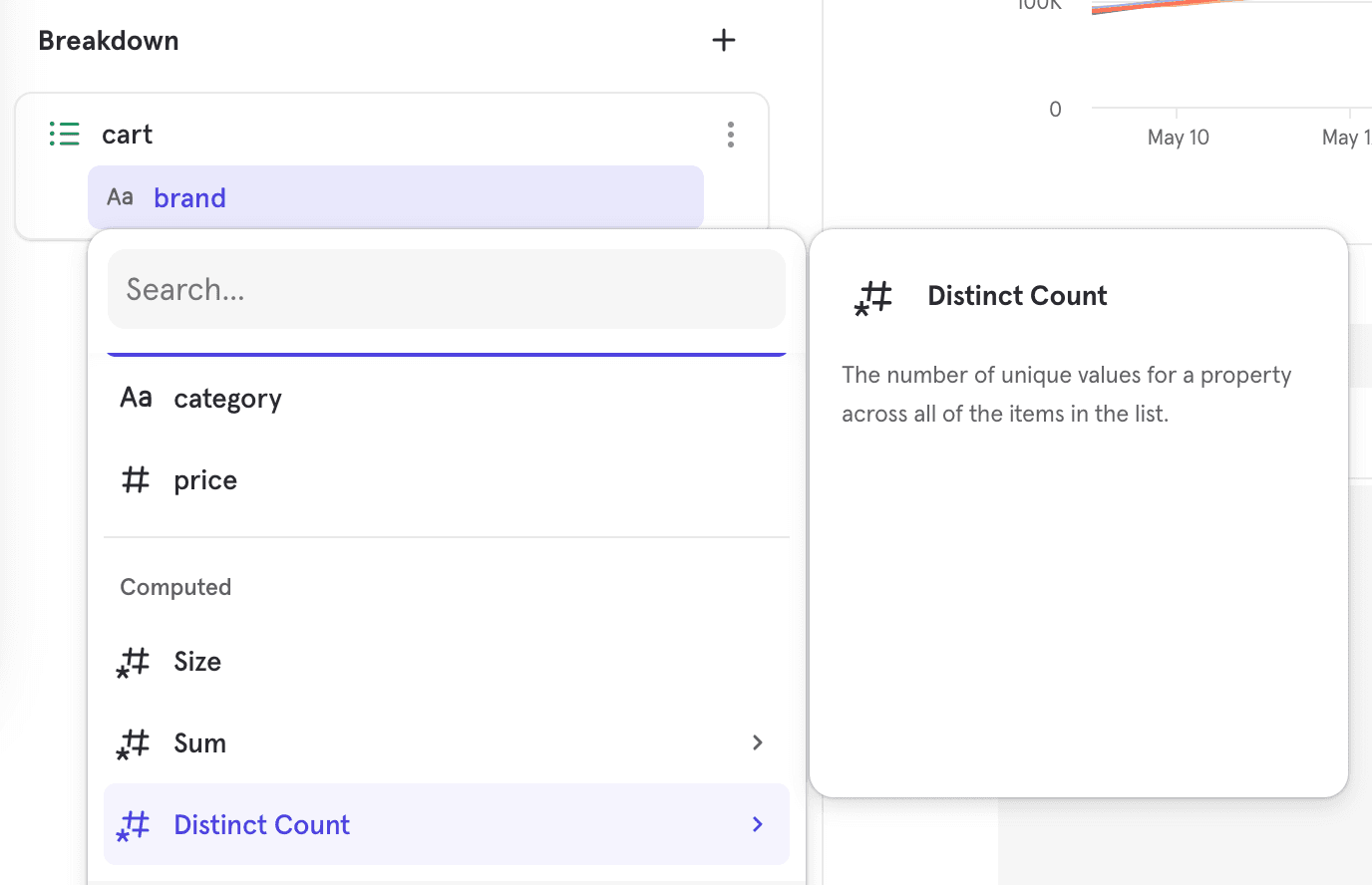
Computed Properties
We provide a few convenient computed properties after a list of objects property is selected. This does a computation on the property, and works similarly to custom properties.
Size
The size, or length of the list as a numeric property.
Sum
Prompts a selection of a numeric property contained within the objects of the list. This will give the total for the whole list for that property.
Distinct Count
Prompts a selection of a property contained within the objects of the list. This will give the number of unique values for that property in the list.
Limits
The list of objects property support will be limited to the first 5 objects within the list property. More details on Object and List of Objects Data Types support in our docs.
For customer's on a paid plan, you may submit a request for approval to have this limit increased by opening a support ticket within the UI (or by sending an email to support@mixpanel.com) with the subject line: “Request for List of Objects Limit Increase”. An increase will not be guaranteed, but your project will be reviewed for feasibility of increasing this limit.
Analyzing First Time Users
Sometimes, you might want to filter an event to only the first time that it's performed by a user. This helps answer the following questions:
- How many users sign up or perform another key event for the first time each week?
- Which referrers do most first time users come from?
- How quickly do users make a purchase after their first time engaging with the app?
- How well do users retain after performing a key event for the first time?
- What events do users perform before and after doing their first purchase?
You can do this by adding a First Time Filter to any event in Mixpanel. This filters the event down to only the first instance of the event performed by a user:
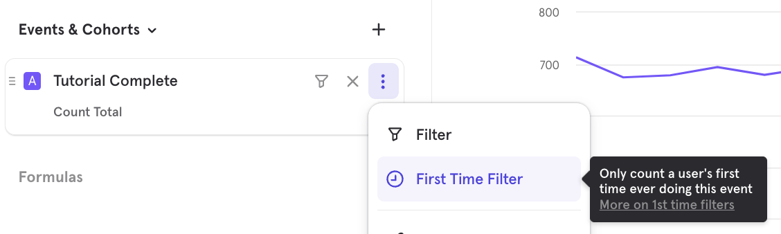
Mixpanel computes this on-the-fly by scanning each user's history to determine if this was the first instance of the event performed by the user, based on timestamp.
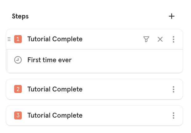
Nth Time
You can analyze the Nth time an event was performed by using a First Time Filter in funnels. For example, this shows you the number of users that do Tutorial Complete 3 times:
Behavioral Properties
Behavioral properties allow you to use your user's activity and use it as a property in your other analysis. A behavioral property is a virtual property, meaning it's not a property that you are explicitly tracking, but a property that Mixpanel can compute and allow you to use in analysis.
Behavioral properties can be used anywhere, most typically in filters and breakdowns.
Frequency per User
After selecting this option, you must select an event to compute the frequency of. You can use this to segment your users by how many times they did an event, or use it to filter out users to only those who did an event a certain number of times.
Aggregate Property per User
After select this option, you must select an event, and then a property on that event. Finally, you can choose an aggregation type for this property. You can use this to segment your users by this property aggregation. For example, you may want to filter only for users who have greater than 100 minutes of video watch time, or you may want to segment users by their watch time.
Time Range
Per Interval
In insights, the time in which this computation is done is on a per interval basis. For a line chart, that will be for each individual interval plotted on the chart. For bar, table and pie, this interval is the entire date range selected in the date picker.
Between Steps
In funnels, the behavioral property is computed in the time range between 2 steps in your funnel. You can specify which steps in the funnel this applies to. In the case of doing "Frequency per User", the event count does not include the events that make up the funnel itself, and only the events between the funnel steps.
After Step 1
In retention, the behavioral property is computed in the chosen time range after the entry event, up until the retaining action. For example, there may be a 7 day window in which we're looking for an event, but if the retaining action happens before the 7 days are up, we no longer count an additional events.
Find Interesting Segments
Determine which users are either driving conversion and retention or behaving as outliers by using the built in “Find Interesting Segments” feature.
Find Interesting Segments can help you discover:
- Whether certain property segments outperform the overall funnel conversion or retention rates.
- Which cohorts perform the best to get ideas on optimizing cohort behavior.
- Which segments are under-performing.
- Changes in the conversion or retention rates of segments.
- Change in population over time in funnels.
User properties are not yet supported.
Interesting Segments in Funnels
View the top and bottom converting segments in your funnel by clicking the Find interesting segments button at the bottom of the segmentation chart.
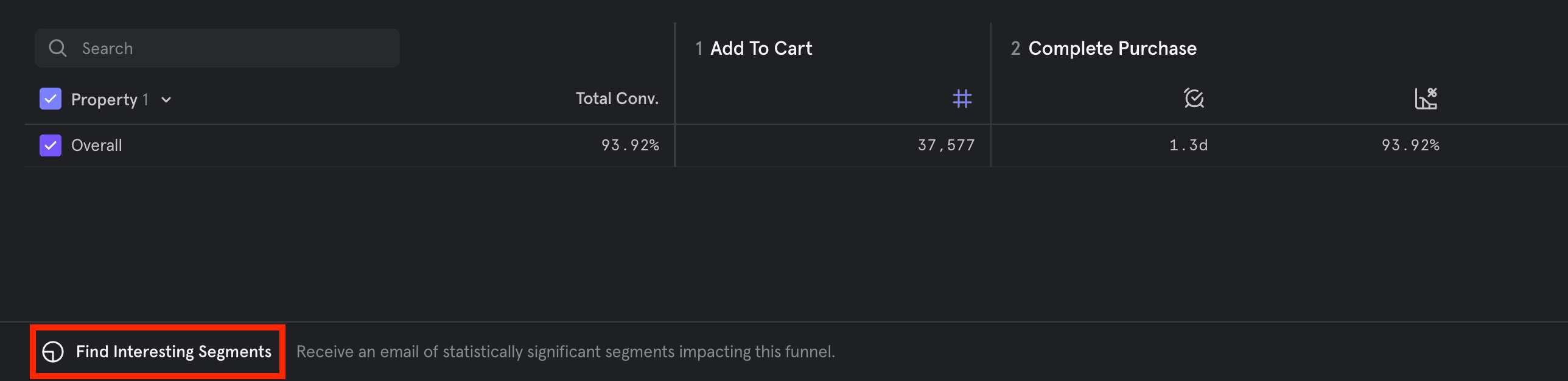
Rather than searching through multiple property breakdowns to find significant data, this feature automatically identifies this data for you. Mixpanel combs through your event properties and cohorts to show you which of those segments convert higher or lower than average, and are therefore statistically significant.
There are two reports you will receive in your email: segment analysis and time comparison.
Segment Analysis
An email that breaks down the top and bottom converting segments of your funnel based on statistical significance and other factors is automatically sent after you click the button. If no statistically significant segments are found, then the email shows non-statistically significant segments.
Segment Analysis helps answer questions such as:
- Which groups of users are driving my conversion rate?
- Which are groups of users are decreasing my conversion rate?
This is done by examining which segments of users are converting at a high rate and have a large enough population size, or which segments are converting at a low rate and have a large enough population size. In the first scenario, this segment would raise the overall conversion rate, while in the second scenario this segment would be lowering the overall conversion rate.
Time Comparison
A time comparison chart is also included in the email. This chart shows a segments behavior over time (in terms of both conversion rate change and population size change) as it relates to the overall population trend (population and conversion rate change).
Time comparison answers questions such as:
- Which groups of users are trending in a way that is different from the overall behavior?
- Which groups of users are driving the overall behavior?
Mixpanel automatically compares the currently selected date period to the previous one. For example, if you are viewing the current week, the email will compare to the week before.
Interesting Segments in Retention
View the top and bottom converting segments in your retention report by clicking the Find interesting segments button at the bottom of the retention chart. This feature is not currently available for Frequency Retention.
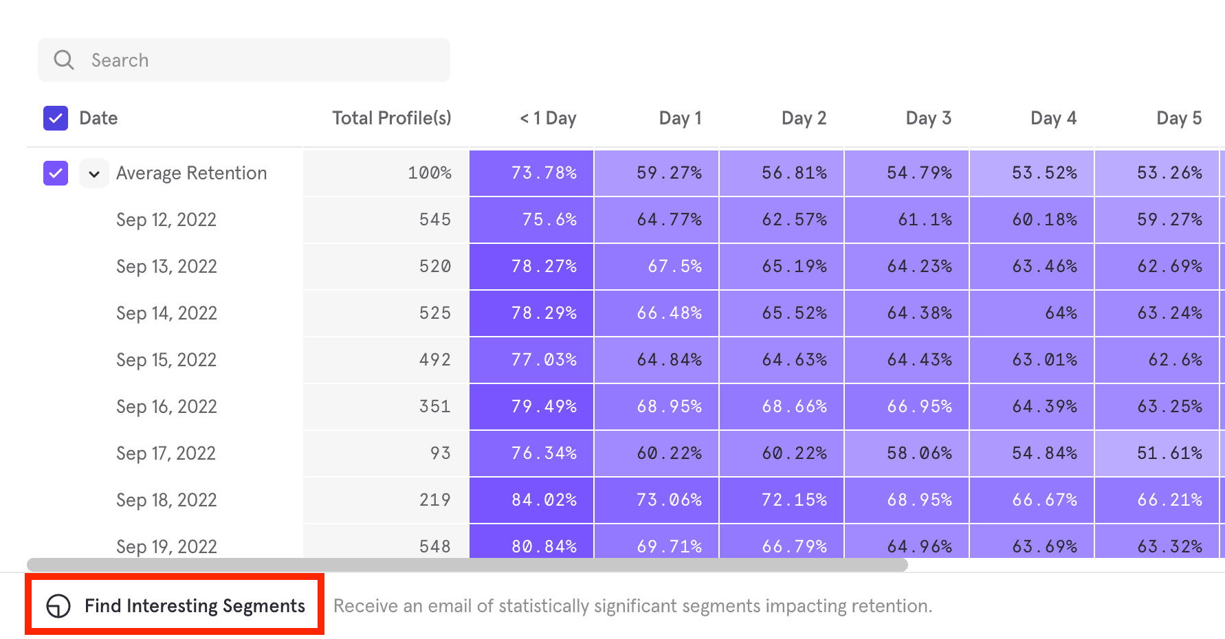
Rather than searching through multiple segment breakdowns to find significant data, this feature automatically identifies that data for you. Mixpanel combs through your event properties and cohorts, and show you which of those segments retain at a higher or lower rate than average.
An email that breaks down the top and bottom retaining segments of your Retention report based on changes on retention rates is automatically sent after you click the button.
Interpret Email Results
When your analysis email says “no interesting segments”, this means that none of the segments you analyzed were behaving significantly differently from the overall population at a large enough volume. To resolve this issue, try extending the date range of the report or try a different report.
If the analysis request included dates in the past five days, and is sent from mobile SDK, data may be delayed and therefore not included at the time of the analysis. Likewise, the date window selected might still fall under conversion window, and more conversions have yet to come through.
Results are sorted by taking into consideration the property, the number of users in the report, as well as the deviation from overall conversion or retention behavior to surface the most meaningful segments to you.
Query Time Sampling
Query-time sampling allows you to query a subset of users and shorten the time it takes for a report to load results. The Insights, Funnels, Retention and Flows reports all support sampling at query time.
This feature is available to enterprise customers with over 5 million MTUs or over 2 billion monthly events.
Enable or Disable Query Time Sampling
Navigate to the report where you would like to enable or disable sampling at time of query.
Enable Sampling
From the report in which you would like to use sampling, click the lightning bolt in the upper right corner of the query builder.
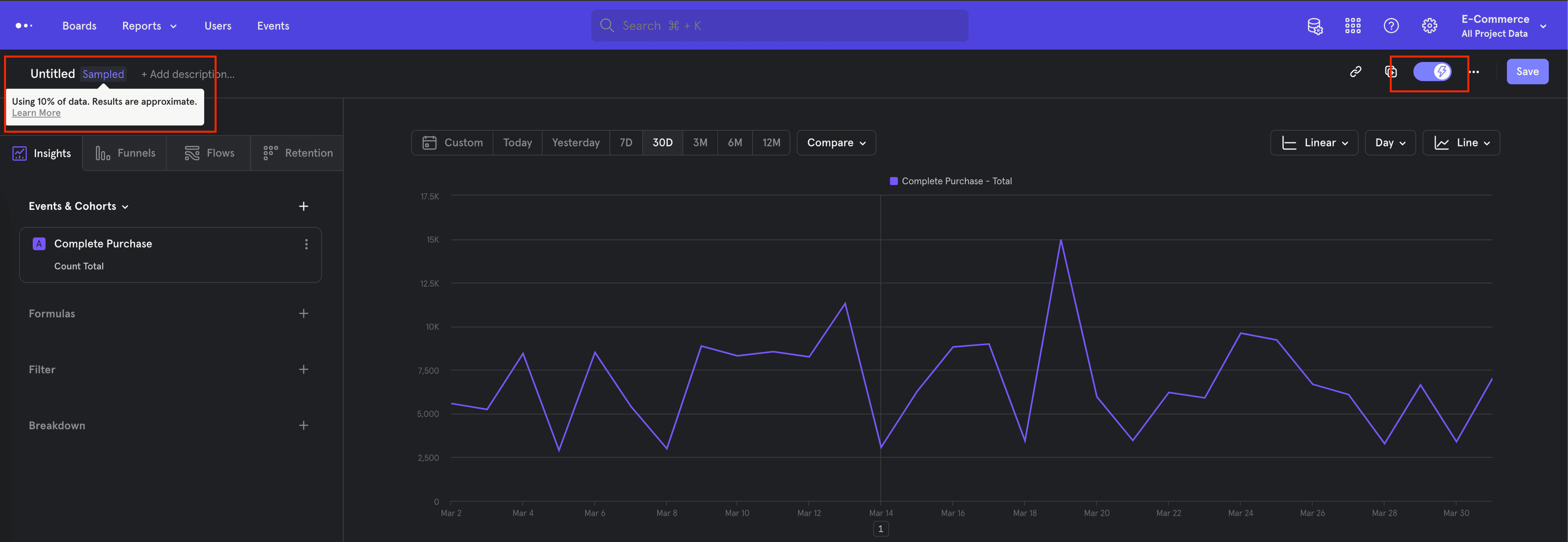
This will enable sampling on the report, and will be indicated by the lightning bolt symbol turning blue. The percentage of the total that is included in the query calculations will be indicated in the top right corner of the query builder.
Disable Sampling
To turn off sampling, click the lightning bolt symbol in the upper right corner of the query builder again.
The lightning bolt symbol will turn grey to indicate that sampling is disabled.
Query Time Sampling Calculation and Presentation
Mixpanel will not sample, or drop, events at ingestion. Instead, Mixpanel will ingest all event data and sample at query time. This prevents the loss of important data, and therefore allows you to toggle sampling on and off depending on need.
For example, if you have a need for iterative querying, then sampling will greatly speed up this process. When you build the proper query, you can turn off sampling and query the entire dataset.
The following occurs when sampling is enabled:
- Mixpanel selects a uniformly random sample of users on which to run the analysis.
- The sample size is 10% of the total population.
- The report is generated using that subset of users.
- Mixpanel up-samples the data by multiplying by the inverse of the sampling factor. This is done for functions such as totals and uniques. Functions that do not scale with users (average, min, max) will not be up-sampled.
- The effect is that numbers should closely approximate results seen without sampling enabled. This works better as the number of users increases, particularly for customers with more than 5 million users.
- Mixpanel adds an annotation to reports.
Saved Reports with Query Time Sampling
If you save a report that uses query time sampling, then a version of the report without sampling is saved. This ensures that Boards and saved reports are computed on the entire dataset for high fidelity.
Query Result Caching
Mixpanel stores the results from a report query in cache, and presents these results from cache when appropriate. This saves time when running a complicated query multiple times, and allows you to surface previously calculated results near-instantaneously. The date range of the query will adjust how Mixpanel presents results from the cache.
- If the query date range is over 30 days, then the query results are cached for up to 24 hours.
- If the query date range is 30 days or under, then the query results are cached for up to 3 hours.
- If the query date range is 1 day, then the query results are cached for up to 15 minutes.
You can see While this highlights the default cache behavior, you can always refresh a report to include the most current data.
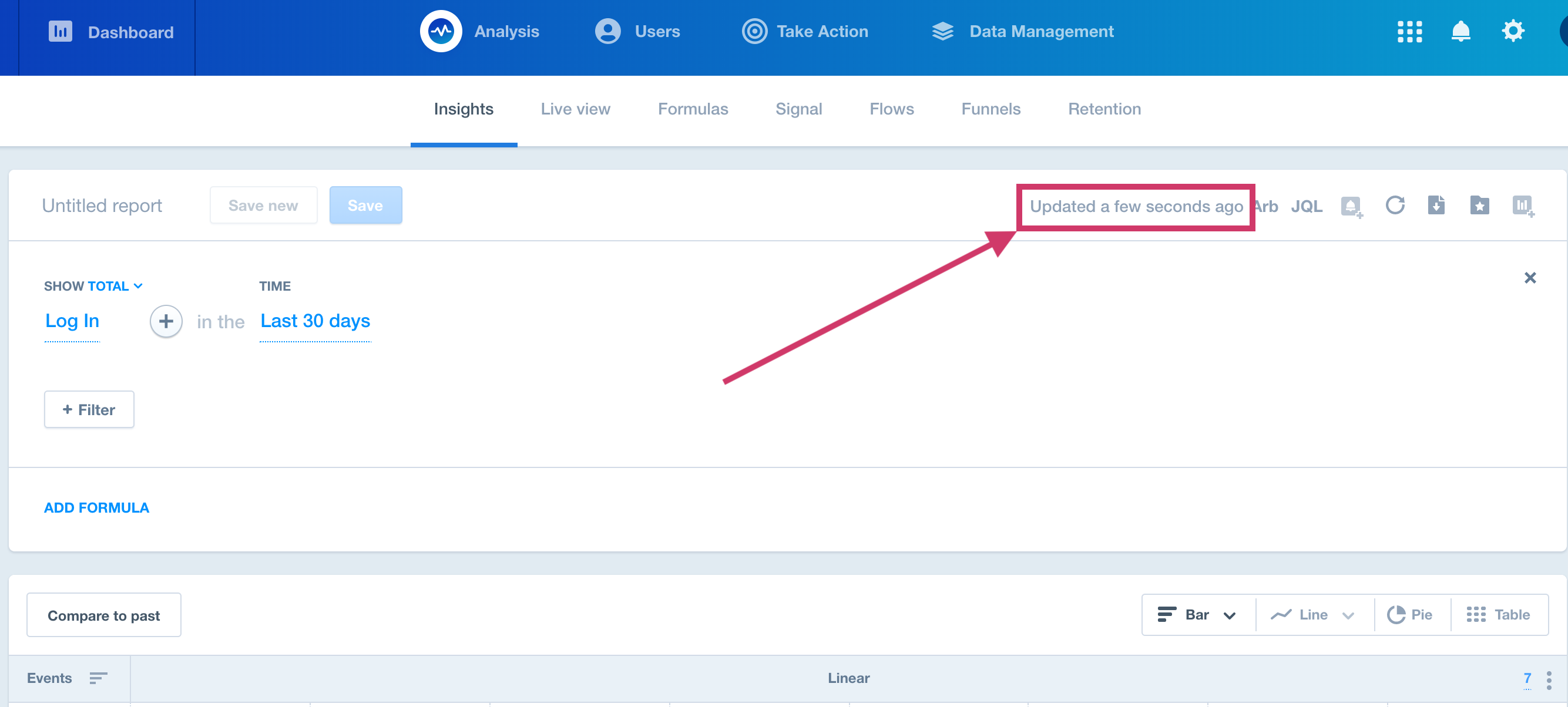
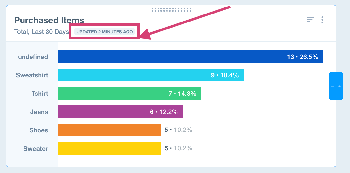
You can also view when the most recent update was in Boards by hovering over report cards.
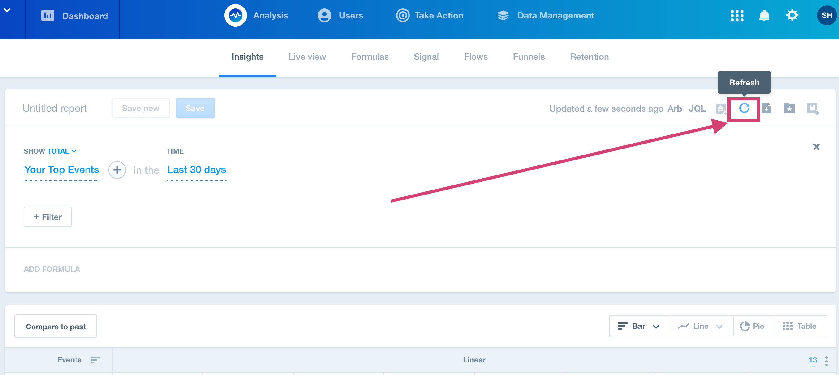
Refreshing the Query Results Cache
To refresh the query results cache, navigate to an Insights report and click the Refresh button at the top of the query builder.
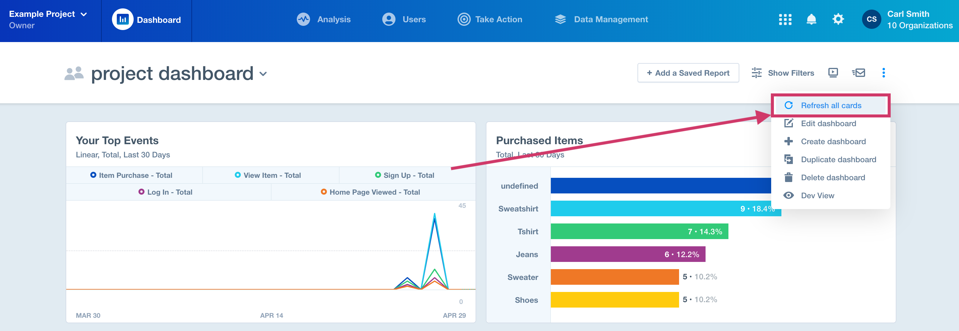
To refresh query results cache in a Board, click the three dots in the top of the Board, and then click the Refresh all cards button.
If the cached result is less than 1 min old, we always serve from cache without running a new background query.
Event and Property Limitations
While all reports in Mixpanel utilize your event data and properties to deliver insight into your business, not all reports can use all event types or properties.
Reports use events and properties to target users, segment data, and filter data. This guide will clarify which reports can use which event types and properties.
Insights: All event types and properties are available in Insights to break down and filter data.
Funnels: Funnels can be calculated by unique or total events. All event types and properties are available to break down and filter data.
Retention: Retention only counts total users, not unique. However, all event types and properties are available to filter data.
Signal: Signal uses only event properties, not user profile properties. However, all event types are available to filter data.
Users: All event types and properties are available in Users.
Downloading Reports from Mixpanel
Users can download reports in three formats:
- CSV
- PNG
Breakdown Limits in Report Downloads
Mixpanel maintains breakdown limits for CSV, PNG, and PDF report downloads.
CSV
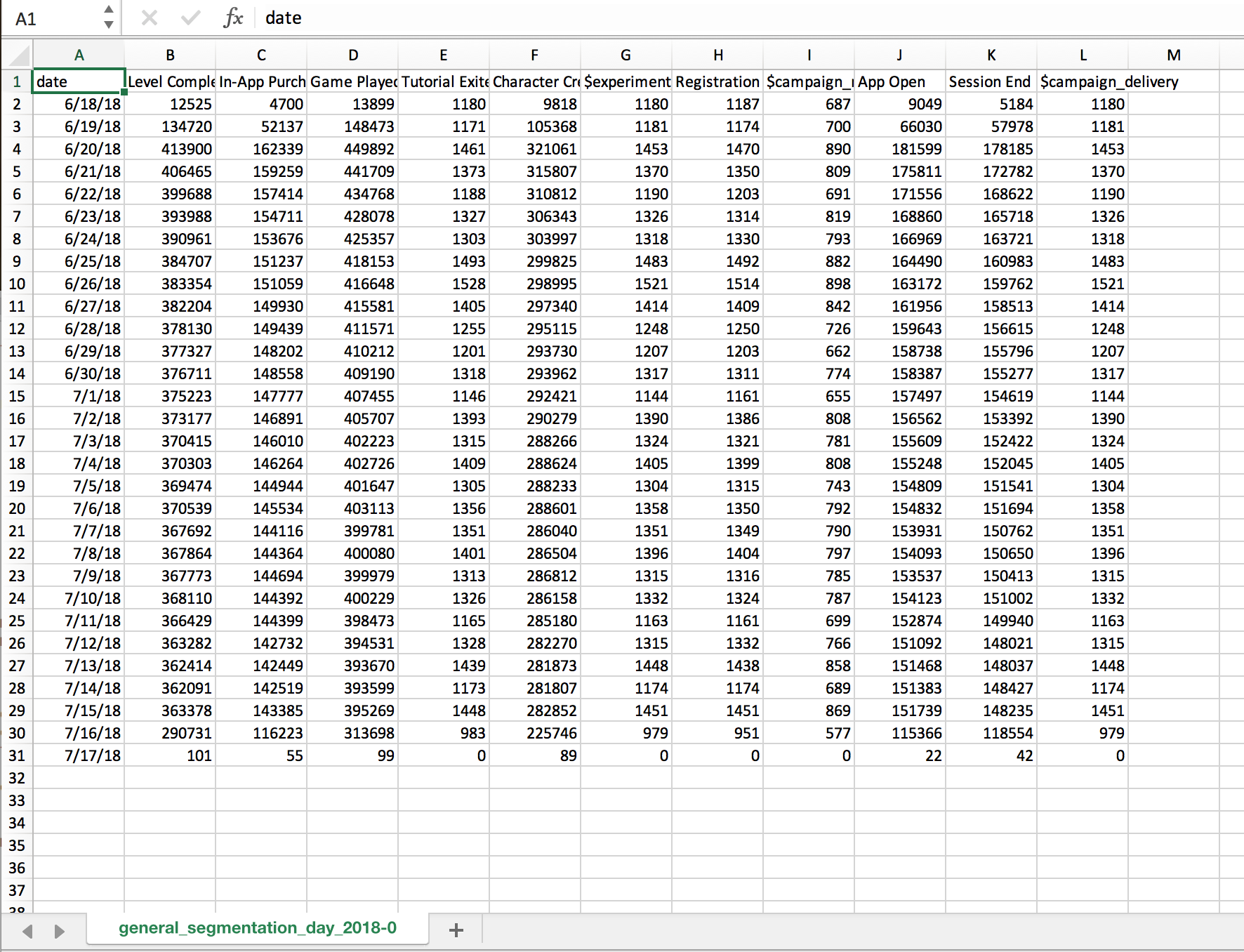
For property values that exceed 10,000, Mixpanel only returns the top 10,000 breakdowns of that property. Here’s an example CSV export of an Insights report. The first column contains the date of when each event was sent. The columns contain the event name and the rows contain the number of each event sent to Mixpanel.
PNG and PDF
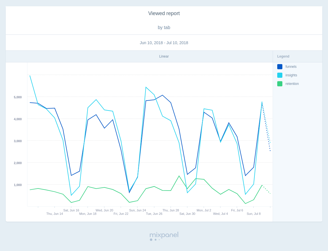
PNG and PDF downloads display up to 30 segments in the Insights table, Insights bar, Retention table, and Retention line; and up to 12 segments for the Insights line. Here’s an example of a chart in PNG format.
Downloading Reports
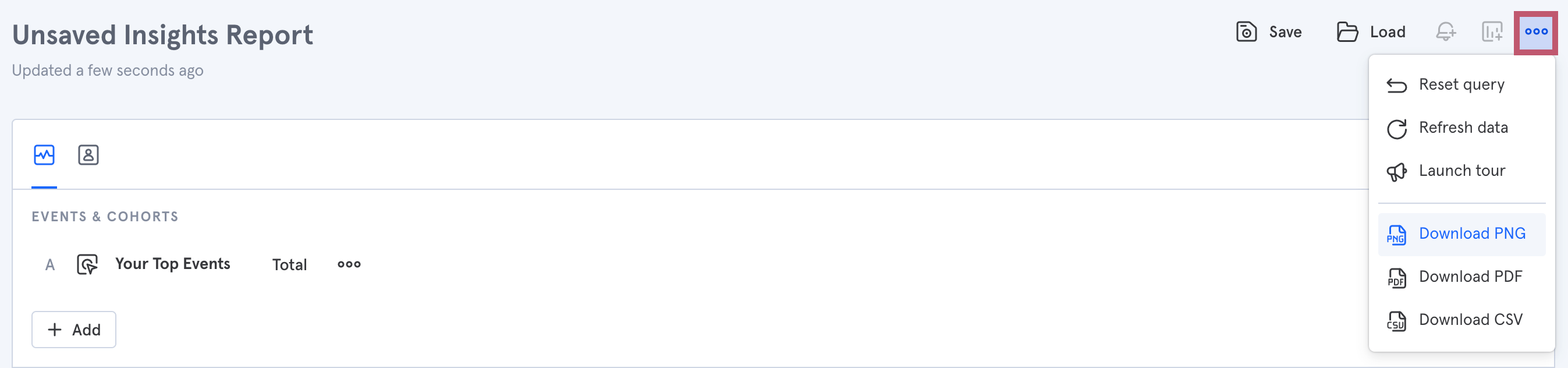
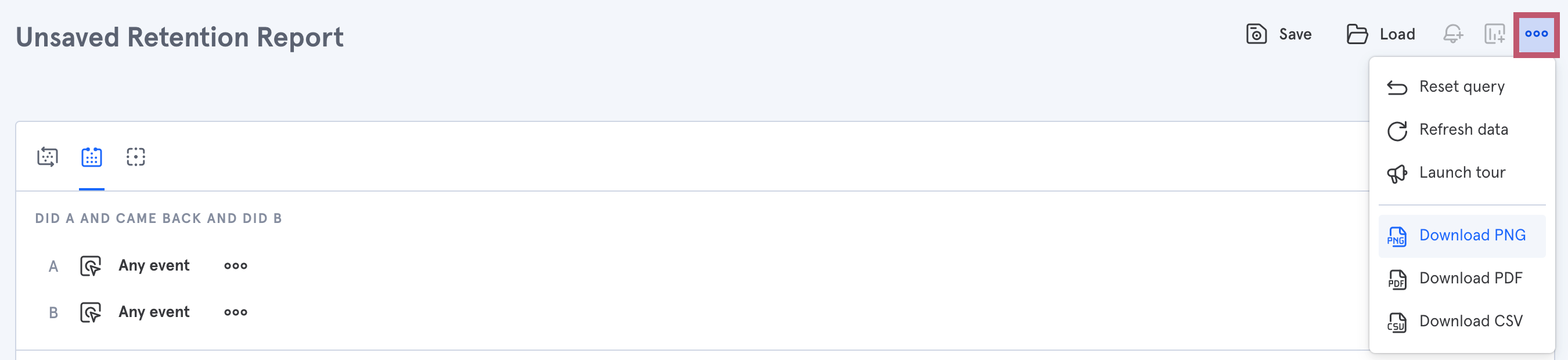
To download Insights, Funnels, and Retention reports, click the "..." icon on the upper right corner of each report.
Insights Download Menu
Funnels Download Menu
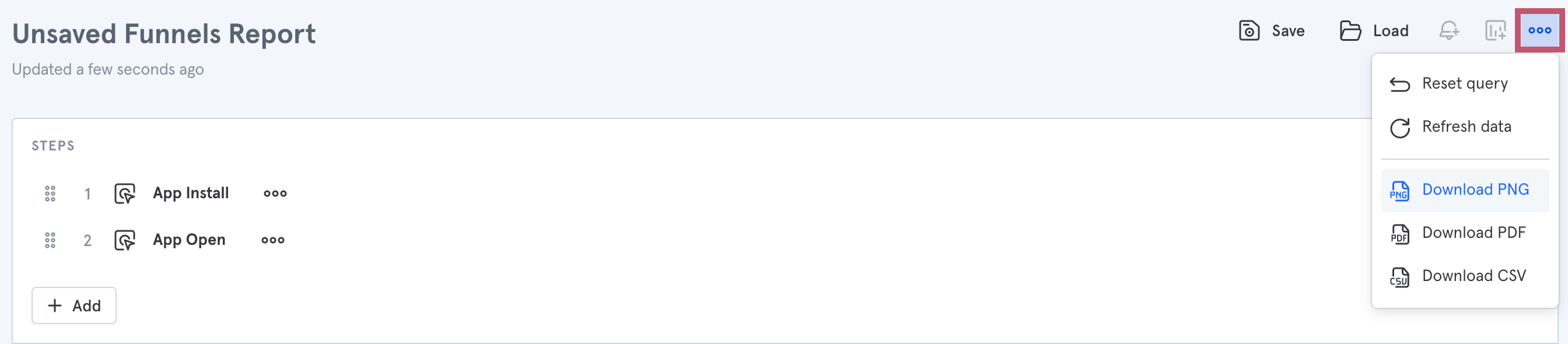
It is possible (only in the Funnels report) to download "CSV Trends", which downloads funnels by date.
Retention Download Menu
Undefined and Null Properties
There are several reasons why you might see "undefined" in your properties list throughout Mixpanel reports when segmenting:
- The specific property you’re segmenting by isn’t always sent along with the event you’re analyzing. For example, let’s say you’re segmenting the event “App Open” by the property “Account type” If there are instances where App Open fires without the Account type property getting sent with it, these will be categorized as “undefined” when you segment by Account type. Another common example is UTM parameters - “undefined” represents users who fired an event without any UTM in the URL that brought the user to your site.
- When segmenting an event by a User Profile property, you’ll see “undefined” if there are User Profile profiles that don’t contain that property or if the event was triggered by a user without a User Profile at all. For example, let’s say you’re segmenting the event “Song Play” by the User Profile property “Favorite Genre.” If there are profiles that have triggered Song Play but don’t have the Favorite Genre property, that value will be “undefined.” Triggers of Song Play by users without a User Profile will also show up under “undefined.”
- For geolocation data (City, Region, Country), the user’s IP couldn’t be mapped to a location, or their IP was not included with the request. For JavaScript implementations, City, Region, and Country are default properties (opens in a new tab). However, if the IP address of the user is not in Mixpanel’s geolocation database and can’t be mapped to a city, region, or country, they will be “undefined” in reports. For server-side implementations, City, Region, and Country can be “undefined” if the IP address is not included with the request. Read more about how Mixpanel maps IP to location.
Remove “undefined” & "null" values from reports
If you don’t want to see “undefined” or "null" values in your report, you can remove them by:
- Unchecking the “undefined/null” box in the visualization legend.
- Looking only at instances where the property in question “is set" - this will exclude values where you see "undefined" or "null":
- Directly exclude undefined or null values from an Insights visualization by hitting the exclude action:
Troubleshooting Tips
If you’re getting “undefined” property values but think you should not be, troubleshoot the issue using the Events page. Click on "Filter" in the top left to look at events coming in where the property in question “is not set.” You can then use this data to look at your code and figure out why some events are being fired without that property.
Was this page useful?